

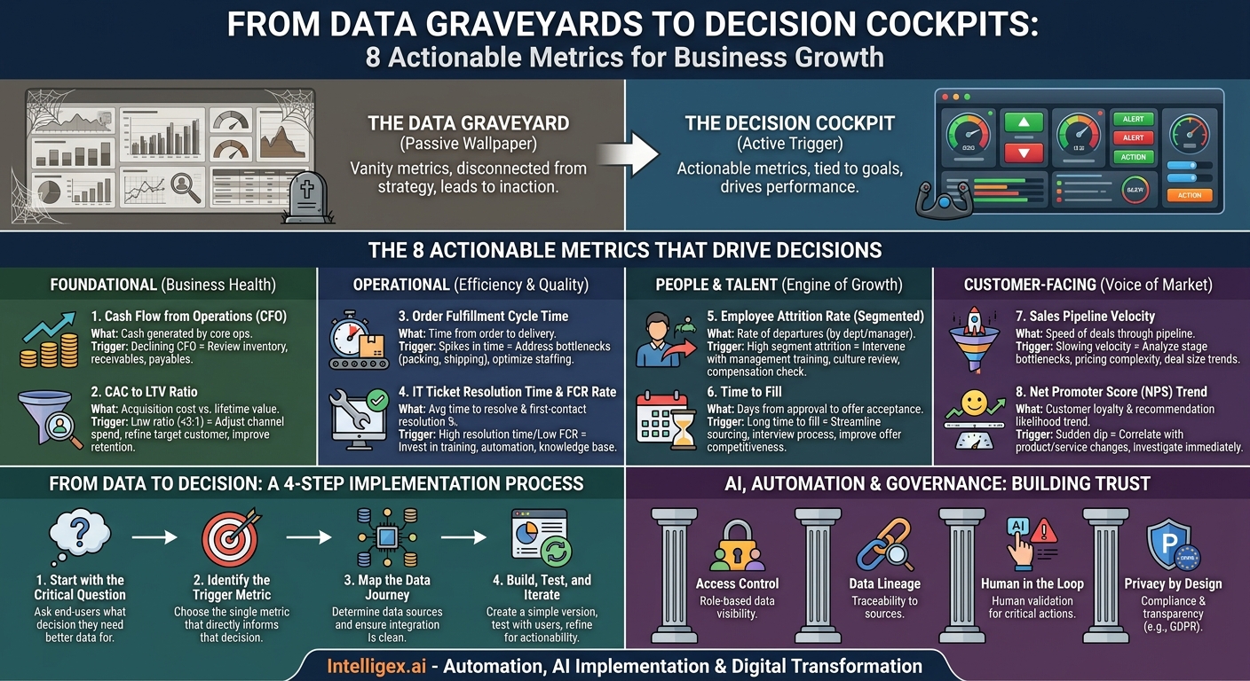
A beautiful dashboard is useless. A dashboard packed with dozens of charts, graphs, and gauges can feel productive, but if it doesn’t lead to a decision, it’s just digital wallpaper. We call these “data graveyards.” They are where information goes to die, disconnected from the daily actions and strategic choices that move a business forward. The alternative is a “decision cockpit,” a streamlined, focused display that tells you not just what happened, but what you should do next. It transforms data from a passive report into an active trigger for improvement.
The difference lies in the metrics you choose to display. Vanity metrics like total sign-ups or page views might look impressive, but they rarely tell you anything about the health of your business. Actionable metrics are different. They are directly tied to your goals, they are understood by the people who need to act on them, and they change in ways that suggest a clear course of action. This guide cuts through the noise to focus on eight such metrics that teams from finance to operations actually use to drive performance, reduce costs, and improve quality.
Foundational Metrics: The Bedrock of Business Health
Before diving into department-specific KPIs, every leadership team needs a clear view of the fundamental health of the organization. These two metrics provide a powerful, high-level snapshot of financial sustainability and market viability. They answer the most basic questions: Are we generating enough cash to operate, and is our model for acquiring customers sustainable?
1. Cash Flow from Operations (CFO)
Who uses it: Executive Leadership, Finance, Operations.
What it measures: The amount of cash generated by a company’s normal business operations. It is distinct from net income because it excludes non-cash items like depreciation and includes changes in working capital (like accounts receivable and inventory).
Why it drives action: Profit on a spreadsheet is theoretical; cash in the bank is real. A positive and growing CFO indicates a healthy, efficient core business. A declining or negative CFO is a critical warning sign that forces immediate questions. Is our inventory growing faster than sales? Are our customers taking too long to pay their invoices? Are our own payment terms with suppliers too aggressive? A dashboard displaying CFO trends provides the visibility to ask these questions before they become a crisis, enabling faster, more informed decisions about managing working capital and operational spending.
2. Customer Acquisition Cost (CAC) to Lifetime Value (LTV) Ratio
Who uses it: Marketing, Sales, Finance, Strategy.
What it measures: This ratio compares the total cost to acquire a new customer (including all marketing and sales expenses) against the total revenue that customer is expected to generate over their entire relationship with the company.
Why it drives action: This is the ultimate measure of go-to-market efficiency and business model scalability. A ratio of 1:1 means you are losing money on every new customer once you factor in the cost of servicing them. A healthy ratio, often cited as 3:1 or higher for SaaS businesses, indicates a profitable growth engine. If the ratio on your dashboard trends downward, it triggers specific actions. The marketing team must investigate channel performance and cut spend on high-CAC, low-LTV channels. The sales team might need to refine its ideal customer profile to focus on more profitable segments. The product team may need to focus on features that increase retention and drive up LTV. It provides a shared, cross-functional metric that aligns sales and marketing on the goal of acquiring profitable customers, not just any customers.
Operational Excellence: Driving Efficiency and Quality
For teams in operations, supply chain, and IT, success is defined by speed, reliability, and cost-effectiveness. The right metrics provide a clear lens into process bottlenecks and service quality, turning gut feelings about “things being slow” into specific, measurable problems that can be solved. These metrics are about improving the internal machinery of the business to deliver better outcomes for customers and employees.
3. Order Fulfillment Cycle Time
Who uses it: Supply Chain, Logistics, E-commerce Operations.
What it measures: The total time elapsed from the moment a customer places an order to the moment they receive it. For maximum actionability, this should be broken down into sub-components: order processing time, warehouse picking and packing time, and transit time.
Why it drives action: The overall cycle time is a key driver of customer satisfaction. A dashboard that breaks this metric down by stage immediately pinpoints the source of delays. Is the “picking and packing” time spiking every Monday morning? This suggests a weekend order backlog and a potential staffing issue. Is “transit time” consistently high for a specific region? This might trigger a conversation with your shipping carrier or an evaluation of opening a new distribution center. By providing this level of visibility, the metric allows managers to move from firefighting daily delays to making strategic improvements in warehouse layout, staffing schedules, or carrier contracts, directly improving delivery speed and reducing operational costs.
4. IT Ticket Resolution Time & First-Contact Resolution (FCR) Rate
Who uses it: IT Help Desk, Infrastructure Teams, HR.
What it measures: Resolution time tracks the average time it takes to completely resolve an employee’s IT issue, from ticket creation to closure. FCR measures the percentage of tickets that are resolved during the very first interaction, without needing to be escalated or followed up on.
Why it drives action: These metrics are direct indicators of employee productivity and IT team efficiency. High resolution times mean employees are waiting longer for the tools they need to do their jobs, which has a real cost. A low FCR rate suggests that front-line support may need more training or that knowledge base documentation is lacking. A dashboard showing a high volume of tickets for the same issue (e.g., password resets or VPN access) provides a clear business case for investing in automation or self-service tools. This allows the IT team to shift resources from repetitive, low-value tasks to strategic projects, improving service quality and reducing frustration across the company.
People and Talent: The Engine of Growth
An organization is only as strong as its people. HR metrics often get a bad reputation for being “soft,” but when tracked correctly, they are powerful leading indicators of organizational health, innovation capacity, and future growth. The key is to move beyond simple headcount and measure the dynamics of talent attraction, development, and retention.
5. Employee Attrition Rate (Segmented)
Who uses it: HR, Executive Leadership, Department Heads.
What it measures: The rate at which employees leave the company. To be actionable, this must be segmented by department, manager, tenure (e.g., first 90 days), and performance level (e.g., high-performers).
Why it drives action: A company-wide attrition rate of 10% is a statistic. A 40% attrition rate in your top-performing sales team under a specific manager is a crisis that requires immediate intervention. Segmenting the data on a dashboard turns a generic number into a precise diagnostic tool. It helps identify management issues, toxic team cultures, compensation problems, or broken onboarding processes. It allows leaders to intervene with targeted solutions like manager training, compensation reviews, or process improvements before they lose more valuable talent, directly impacting productivity and recruiting costs.
6. Time to Fill
Who uses it: HR, Recruiting, Hiring Managers.
What it measures: The number of days between a job requisition being approved and a candidate accepting the offer.
Why it drives action: Every day a critical role sits open, a team is understaffed, projects are delayed, and revenue may be at risk. This metric quantifies the cost of a slow recruiting process. A dashboard that breaks “Time to Fill” down by hiring stage (e.g., sourcing, interviewing, offer) reveals the specific bottleneck. Are roles sitting in the “sourcing” stage for weeks? You may have a problem with your job descriptions or sourcing channels. Are candidates dropping out after the final interview? Your interview process might be too long or your offers uncompetitive. This data gives the recruiting team the evidence needed to have productive conversations with hiring managers and make specific changes to streamline the process, improving the company’s ability to attract top talent at speed.
Customer-Facing Metrics: The Voice of the Market
How you acquire, serve, and retain customers determines your long-term success. These metrics provide a direct line of sight into the effectiveness of your sales engine and the health of your customer relationships. They help teams move from activity-based goals (e.g., number of sales calls) to outcome-based goals (e.g., a faster, more predictable revenue pipeline).
7. Sales Pipeline Velocity
Who uses it: Sales Leadership, Sales Operations, Finance.
What it measures: How quickly deals are moving through the sales pipeline from initial qualification to closed-won. The formula is often: (Number of Opportunities x Average Deal Size x Win Rate) / Length of Sales Cycle.
Why it drives action: A sales pipeline with a lot of deals that never close is a huge drain on resources. Pipeline velocity is a comprehensive health metric for your entire sales process. A slowing velocity is a leading indicator that you will miss future revenue targets. A dashboard tracking this metric forces a deeper look into the “why.” Are deals getting stuck at the proposal stage? Perhaps your pricing is too complex. Is the average deal size decreasing? Maybe your reps are discounting too heavily. Tools like Salesforce are designed to track this, but the key is surfacing the velocity metric itself. It shifts the conversation from “how much is in the pipeline?” to “how healthy and fast is our pipeline?” enabling sales leaders to coach reps, refine processes, and forecast revenue with greater accuracy.
8. Net Promoter Score (NPS) Trend
Who uses it: Customer Success, Product Management, Marketing, Leadership.
What it measures: A customer loyalty and satisfaction metric calculated by asking customers a single question: “On a scale of 0-10, how likely are you to recommend our product/company to a friend or colleague?” The trend over time is more important than the absolute number.
Why it drives action: A static NPS score is a vanity metric. A trendline on a dashboard is an early warning system. A sudden dip in your NPS score is a powerful signal that something is wrong. The real action comes when you correlate that dip with other business events. Did the score drop the week after you released a new user interface? Your product team has immediate, quantifiable feedback that the changes are not working for users. Did it fall after a change in your support policy? Your customer success team knows it needs to revisit the decision. This metric provides an unfiltered, high-level view of customer sentiment, giving teams a clear signal to investigate specific changes and their impact on the customer experience.
From Data to Decision: A 4-Step Implementation Process
Knowing which metrics to track is only half the battle. Building a dashboard that your team will actually use requires a deliberate process focused on decisions, not just data visualization. Tools like Tableau or Microsoft Power BI are powerful, but they are only effective when guided by a clear strategy.
- Start with the Critical Question. Before you look at any data, ask the end-user a simple question: “What is one decision you have to make every week where you wish you had better information?” This focuses the effort on a real-world business need. For example, a marketing manager might say, “I need to decide where to allocate my ad budget for next month.”
- Identify the Trigger Metric. Based on that question, identify the single metric that would most directly inform the decision. For the marketing manager, this might be “Cost per qualified lead, broken down by advertising channel.” This becomes the headline metric for the dashboard.
- Map the Data Journey. Now, work backward. What data sources are required to calculate this metric? For “cost per qualified lead,” you need ad spend data from Google Ads and Facebook, and lead status data from your CRM. This step is where the technical work of data integration begins, ensuring data is clean, accurate, and accessible.
- Build, Test, and Iterate. Create the simplest possible version of the dashboard with just the trigger metric and its essential context. Show it to the manager and ask, “When you see this number go up or down, do you know what to do?” If the answer is no, the dashboard isn’t finished. Iterate by adding necessary context or drill-down capabilities until the path from insight to action is obvious.
A Note on AI, Automation, and Governance
As dashboards evolve, they often incorporate more advanced capabilities like predictive forecasting or automated anomaly detection powered by AI. While powerful, this also introduces new responsibilities for data governance. Using data, especially sensitive employee or customer data, requires a framework of trust and security. Without it, your advanced dashboard can become a source of risk rather than an asset.
Before deploying an AI-enhanced or highly sensitive dashboard, ensure you have a clear plan for the following:
- Access Control: Not everyone should see everything. Use role-based access to ensure that financial data is restricted to the finance team and individual performance metrics are only visible to the employee and their direct manager.
- Data Lineage: When a metric looks wrong, you must be able to trace it back to its source systems. Clear data lineage builds trust in the dashboard and dramatically speeds up troubleshooting.
- Human in the Loop: AI can be great at spotting patterns, but it lacks business context. For critical decisions, especially those flagged by an automated alert, establish a process that requires human review and validation before action is taken.
- Privacy by Design: When handling personal data, ensure your processes and systems are compliant with regulations like GDPR from the very beginning. Anonymize data where possible and be transparent about how it is being used. More information on this can be found at resources like the official GDPR portal.
Your Next Steps to an Actionable Dashboard
Moving from a data graveyard to a decision cockpit doesn’t happen overnight. It starts with a single, focused step. Don’t try to build a master dashboard for the entire company. Instead, pick one department and one critical business question that needs a better answer.
Sit down with that team and identify the one or two metrics that would drive their daily or weekly decisions. Validate that if they had this information, presented clearly and reliably, it would change their behavior for the better. The initial challenge is rarely the visualization; it’s getting clean, trustworthy data from multiple systems into one place. This is where a clear integration strategy is not just helpful, but essential. By focusing on action from the start, you ensure that your investment in data and analytics pays real dividends in speed, efficiency, and smarter decision-making.
Your Next Read:
Category:
Get a FREE
Proof of Concept
& Consultation
No Cost, No Commitment!