

A senior executive points to a chart in your quarterly business review and asks a simple question: “Where does this number come from?” For many teams, this question triggers a frantic scramble. Analysts dig through queries, engineers trace back data pipelines, and business managers compare notes from different spreadsheets. The answer, when it finally arrives days later, is often a complex and unsatisfying “it depends.” This single moment erodes trust in the data, slows down decision-making, and costs the business real time and money.
The problem isn’t a lack of data. It’s a lack of visibility. Without a clear, end-to-end understanding of how a metric is constructed, you’re making critical business decisions based on a black box. A metric lineage map solves this. It’s not just a technical diagram for the IT department; it’s a business tool for building trust, improving quality, and accelerating the pace of your entire organization.
What is a Metric Lineage Map?
Think of a metric lineage map as a family tree for your data. It visually traces a key performance indicator (KPI) from its final destination, like a dashboard or report, all the way back to its original source systems. It documents every stop along the journey: every transformation, every piece of business logic, every system it passes through, and every team that touches it.
For example, a lineage map for “Customer Churn Rate” wouldn’t just point to a database table. It would show that the raw data originates in your Salesforce CRM (customer status) and your Stripe payment processor (subscription end dates). It would then trace how an ETL (Extract, Transform, Load) process pulls that data into a cloud data warehouse like Amazon Redshift or Google BigQuery. From there, it would document the specific SQL queries that define what an “active customer” is and calculate the churn percentage. Finally, it would show how that calculated field is pulled into a tool like Tableau to be displayed in the executive dashboard.
This clarity provides immediate business value:
- Quality and Trust: When you can prove exactly how a number is calculated, leaders can trust it to make strategic decisions. There are no more “dueling spreadsheets” in meetings.
- Speed and Agility: If a metric suddenly looks wrong, a lineage map turns a multi-day investigation into a targeted, hours-long fix. You can instantly see which upstream process likely failed.
- Visibility and Impact Analysis: Planning to update your CRM? A lineage map shows you precisely which downstream reports and metrics will be affected, preventing unexpected breakages and business disruption.
- Cost Reduction: Teams spend less time on manual data validation, redundant data processing, and fire drills, freeing them up for higher-value analysis.
The Anatomy of a Metric: From Raw Data to Business Insight
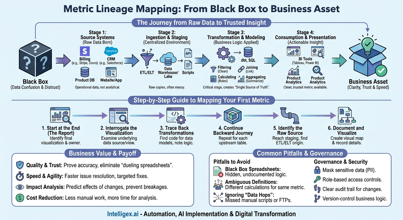
Every metric in your organization, whether it’s “Average Order Value” for an e-commerce company or “Time to Hire” for HR, follows a similar lifecycle. Understanding these stages is the first step to mapping them effectively. Let’s break down the journey using a common and critical business metric: Monthly Recurring Revenue (MRR).
Stage 1: Source Systems
This is where the raw data is born. It is almost never clean, perfectly formatted, or ready for analysis. For MRR, the source data is scattered across multiple operational systems.
- Billing System (e.g., Stripe, Zuora): Contains raw transaction data, subscription plans, plan prices, and payment dates.
- CRM (e.g., Salesforce): Holds customer account information, contract start and end dates, and any negotiated custom pricing.
- Product Database: Contains user account information and product usage data, which might be needed to determine if an account is “active.”
At this stage, the data exists to serve the primary function of the application (processing a payment, managing a sales lead), not for analytical reporting.
Stage 2: Ingestion and Staging
The raw data must be moved from its source systems into a centralized analytical environment, typically a data warehouse or data lake. This process, often called ETL or ELT, uses a combination of API connectors, data loaders (like Fivetran or Stitch), or custom scripts. The data is loaded into “staging” tables, which are often raw, messy copies of the source data.
Stage 3: Transformation and Modeling
This is the most critical and often the most opaque stage. Raw data is cleaned, combined, and reshaped to become useful for analysis. This is where business logic is applied. For our MRR metric, several transformations occur here, typically using SQL or a tool like dbt.
- Filtering: Removing test accounts and internal users.
- Joining: Linking billing data with CRM data on a customer ID to get the full picture of an account.
- Calculating: Applying logic to handle prorated subscriptions, upgrades, downgrades, and discounts.
- Aggregating: Summing up the recurring revenue components for all active customers to produce a single MRR figure.
The output is a clean, reliable data model, often called a “mart” or “view,” that represents the single source of truth for MRR.
Stage 4: Consumption and Presentation
This is the final step, where the calculated metric is made available to business users. The clean MRR data model feeds into a Business Intelligence (BI) tool like Power BI or a product analytics platform. Analysts and business leaders can now explore this trusted number, visualize it in charts, and drill down into its components without ever touching the complex code that created it.
Step-by-Step: Mapping Your First Critical Metric
The idea of mapping every metric can be overwhelming. The key is to start small with one high-value, high-pain metric. Choose a number that is frequently debated or has caused confusion in the past. This practical, step-by-step process will demonstrate value quickly and build momentum for a broader initiative.
- Start at the End (The Report): Identify the final dashboard or report where the metric is displayed. Don’t start with the source systems. Find the chart your Head of Sales looks at every morning. Identify the tool it’s in (e.g., Tableau, Power BI) and the person who owns it (e.g., a Sales Operations Analyst).
- Interrogate the Visualization: Working with the owner, examine the data source for that specific chart. Most BI tools have an interface that shows the underlying query or data model. What table or view is it pulling from? What filters are applied at the report level? Document this meticulously. For example: “Sales Dashboard -> YTD Revenue Chart -> pulls from a view named `sales_analytics.quarterly_revenue_kpi`.”
- Trace Back Through the Transformations: Now, move to your data warehouse. Find the code that creates `sales_analytics.quarterly_revenue_kpi`. This is your first major transformation layer. You will likely find it is built by joining several other tables together, such as `transformed_invoices` and `customer_master`. Document the names of these upstream tables and the core business logic in the query (e.g., `WHERE invoice_status = ‘PAID’`).
- Continue the Backward Journey: For each of the tables you just identified (like `transformed_invoices`), repeat the process. Find the code that creates them. You are peeling back the layers of the onion. You might find that `transformed_invoices` is created from a staging table called `stg_stripe_invoices`.
- Identify the Raw Source: Once you reach a “staging” table, you have likely found the edge of your warehouse. The final step is to identify how data gets into that table. Look for the ETL/ELT script or tool responsible for loading it. This will point you to the ultimate source system and object. For example: “The `stg_stripe_invoices` table is populated daily by a Fivetran connector pulling from the `invoices` object in the Stripe API.”
- Document and Visualize: As you go, document each step in a simple format. You can use a spreadsheet, a wiki page, or a diagramming tool. For each step, capture the System, the specific Object (table, view, report), the Owner, and a brief description of the logic. The visual map will be a powerful communication tool that shows the true complexity behind a single number.
Common Pitfalls and How to Avoid Them
As you build out your first lineage maps, you will uncover hidden complexities and bad habits. Recognizing these common pitfalls is the first step to fixing them and improving your organization’s data maturity.
The “Black Box” Spreadsheet
The Pitfall: A critical step in a metric’s calculation happens inside a manually maintained spreadsheet. A finance analyst downloads sales data, performs complex calculations and lookups in Excel, and then uploads the final result to a database. The logic is undocumented, not version-controlled, and completely invisible to any automated lineage tool.
How to Avoid It: Champion a “centralize and codify” approach. Work with the analyst to understand their spreadsheet logic and replicate it in SQL within the data warehouse. This makes the logic transparent, repeatable, and version-controlled. The spreadsheet becomes a simple data consumption tool, not a hidden transformation engine.
Ambiguous Definitions
The Pitfall: You discover that the Sales team’s “Monthly Active User” metric is calculated differently from the Product team’s. Sales counts any user who logs in, while Product only counts users who perform a specific key action. Both metrics are valid for their purpose, but they cause massive confusion when used interchangeably.
How to Avoid It: Use lineage mapping to expose these discrepancies. Force a conversation to establish a governed, organization-wide data dictionary. Create a certified data model (e.g., `dim_users`) with clearly defined fields like `is_active_sales` and `is_active_product` so there is no ambiguity.
Ignoring the “Data Hops”
The Pitfall: Your map correctly identifies the source CRM and the destination data warehouse, but misses a crucial step in between: a nightly Python script running on a developer’s machine that pulls data from one place, reshapes it, and FTPs it to another.
How to Avoid It: Automated tools are powerful, but they are never a complete substitute for human knowledge. Interview the people who work with the data every day. The informal processes, manual workarounds, and “temporary” scripts are often the most critical (and fragile) parts of the lineage chain.
Governance and Security: Protecting Data Along the Way
A data lineage map is not just a flowchart; it’s a foundational component of strong data governance and security. By understanding the path data takes, you can implement controls more effectively and reduce risk.
When your lineage map includes sensitive customer data or involves AI/ML models, these considerations become paramount. The goal is not to lock data down but to enable its safe and responsible use.
Use your lineage map to perform a quick governance check:
- Is sensitive data (PII) masked or anonymized at the earliest possible stage? For example, customer email addresses should be masked in analytical tables and only visible in the source CRM to authorized support staff.
- Are access permissions based on roles, not individuals? A lineage map helps define what data a “Sales Analyst” role needs versus a “Financial Planner” role, ensuring people only see what is necessary for their job.
- Is there a clear audit trail? The map should help you confirm that you can track who accessed or changed data at each critical stage of the pipeline.
- Is the business logic version-controlled? When the definition of a metric changes, it should be a deliberate, auditable event (like a code commit in Git), not an accidental change in a shared file.
For AI models that might predict a metric like “Customer Lifetime Value,” the lineage map is even more important. It must document the model’s version, the features it was trained on, and the source of that training data. This provides crucial explainability and ensures a human can always validate the model’s output and understand its impact on business reporting.
The Business Payoff: More Than a Technical Diagram
The true value of a lineage map is realized when it moves from a technical exercise to a strategic asset. By making the flow of data transparent, you unlock tangible business benefits that go far beyond the data team.
Faster Incident Response: When a key metric on the executive dashboard is wrong, the old way was a “all hands on deck” fire drill that could take days. The new way is a targeted response. The lineage map immediately narrows the search to a few potential upstream failure points. A broken data pipeline that once caused a 48-hour data outage can now be identified and fixed in under an hour.
Confident System Migrations: Imagine your IT team needs to migrate from a legacy on-premise ERP to a modern cloud-based system. Without a lineage map, this is a high-risk project filled with guesswork about what downstream reports might break. With a clear map, you have a definitive impact analysis. You can proactively build new data pipelines and validate metrics from the new system against the old one, ensuring a smooth transition with zero disruption to business reporting.
Accelerated and Scalable Analytics: When new analysts join your team, how long does it take them to become productive? Without lineage, they spend months learning the tribal knowledge of your data landscape. With well-documented lineage for your core metrics, they can confidently and safely use certified data models from day one. This allows them to focus on generating new insights instead of re-creating the same basic queries, dramatically improving the scalability of your analytics function.
Your Next Steps: Building Your First Lineage Map
Getting started with data lineage doesn’t require a six-month project or a massive software investment. It requires focus, collaboration, and a commitment to making one small part of your data world more transparent. Here is your action plan:
- Assemble a small, cross-functional team. Get the business user who depends on the metric, the analyst who builds the reports, and the engineer who manages the data pipeline into the same virtual room.
- Pick one critical, painful metric. Don’t try to map everything at once. Choose one KPI that is highly visible and frequently causes confusion or debate. The pain you solve will be your proof of concept.
- Timebox the effort. Set a realistic goal, such as mapping the chosen metric from end-to-end in one week. The objective is to learn the process and create a tangible artifact, not to achieve perfection. Use a simple tool like a wiki page or diagramming software.
- Share your findings widely. Present the finished lineage map to stakeholders. The visual of seeing the 10-15 steps behind a “simple” number is often an eye-opening experience. It builds a powerful, data-driven case for investing more deeply in data governance, documentation, and tooling like that found on the AWS cloud.
By taking these concrete steps, you begin the journey of transforming your organization’s data from a source of confusion into a trusted, strategic asset that drives better, faster decisions.
Your Next Read:
Category:
Get a FREE
Proof of Concept
& Consultation
No Cost, No Commitment!