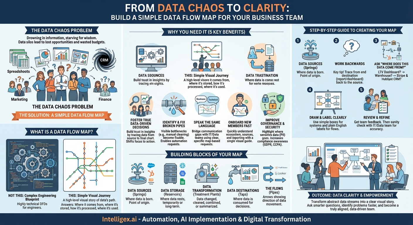
In the modern business landscape, we’re constantly told to be “data-driven.” It’s a fantastic ideal, but what does it actually mean when your team is staring at a dozen different dashboards, a sea of spreadsheets, and a CRM that feels like a black hole? The marketing team sees clicks, the sales team sees deals, and the finance team sees revenue, but connecting those dots can feel like an impossible task. This disconnect is where opportunities are lost, budgets are wasted, and brilliant strategies fail to launch.
The problem isn’t a lack of data; it’s a lack of clarity. We’re drowning in information but starving for wisdom. What if you had a simple map? Not a complex architectural schematic only a data engineer could love, but a straightforward, visual guide that shows you exactly how information travels through your business. This is the power of a simple data flow map, and it’s one of the most transformative tools your business team can create.
What is a Data Flow Map (and What It Isn’t)?
Let’s clear the air right away. When data professionals talk about “data flow diagrams” (DFDs), they often mean highly technical, granular documents that detail servers, databases, and specific data transformations. That is not what we’re talking about here.
For a business team, a data flow map is a high-level, visual story of your data’s journey. Think of it like tracking a package. You don’t need to know the specific model of the delivery truck or the route numbers of the interstate highways it travels. You just need to know where it started (the warehouse), the key checkpoints it passed through (the distribution centers), and where it ended up (the customer’s doorstep).
Our business-friendly data flow map does the same thing. It answers fundamental questions in a simple, visual format:
- Where does our data come from? (e.g., Website forms, social media, our mobile app)
- Where does it get stored or processed? (e.g., A CRM, a data warehouse, Google Sheets)
- What happens to it along the way? (e.g., It’s combined with other data, cleaned up, summarized)
- Where does it end up being used to make decisions? (e.g., A sales dashboard, a marketing report, a financial forecast)
It’s a subway map for your data, not an engineering blueprint for the entire subway system. It prioritizes clarity over exhaustive technical detail, making it an accessible tool for everyone, from a marketing coordinator to a VP of Sales.
Why Your Business Team Desperately Needs This Map
Creating this map might seem like a “nice-to-have” exercise, but its impact is profound. It’s a foundational step that unlocks efficiency, trust, and smarter decision-making across the board.
1. Foster True Data-Driven Decisions
You can’t trust a report if you don’t trust the data behind it. How many times has someone in a meeting questioned a chart by saying, “But where is that number really coming from?” A data flow map eliminates this ambiguity. When your team can visually trace the path from the original source (like a Salesforce entry) to the final destination (a chart in a QBR deck), they build confidence in the insights presented. This trust is the bedrock of a truly data-driven culture. It shifts conversations from doubting the data to debating the best course of action based on the data.
2. Identify and Fix “Broken Pipes”
Data doesn’t always flow smoothly. Sometimes it gets stuck, corrupted, or delayed. A data flow map is your primary diagnostic tool. For example, the sales team might complain that the leads they receive from marketing are missing crucial information. By mapping the flow, you might discover that data from a website form is sent to a spreadsheet for manual cleaning before being uploaded to the CRM. This manual step is a bottleneck and a point of failure. The map makes this “broken pipe” visible, allowing you to ask a more specific question: “How can we automate the flow from the website form directly into the CRM?”
3. Speak the Same Language as Your Technical Teams
One of the biggest sources of friction in any organization is the communication gap between business and technical teams (like IT or data engineering). Business teams make vague requests like, “We need a report with better sales data,” leaving the technical team to guess what they mean. Armed with a data flow map, you can have a much more productive conversation. You can point to the map and say:
“We see that our sales dashboard pulls data from the data warehouse. We need to add customer support ticket data from Zendesk into that same data warehouse so we can see how support activity impacts customer retention on our dashboard.”
This single, specific, and context-rich request saves weeks of back-and-forth and ensures you get exactly what you need.
4. Onboard New Team Members in Record Time
How do you explain your team’s complex ecosystem of tools and reports to a new hire? You could spend days walking them through a dozen different systems, or you could hand them a one-page data flow map. This visual guide gives them an immediate mental model of how your team operates. They can quickly understand what data sources are important, which reports are authoritative, and how the work they do contributes to the overall flow of information. It’s an incredibly powerful tool for accelerating their time-to-productivity.
5. Improve Data Governance and Security
Even for non-technical teams, understanding the flow of sensitive information is crucial. Where does personally identifiable information (PII) like customer emails and phone numbers go? Your map can highlight the systems that handle this sensitive data. This awareness helps everyone on the team be more mindful of compliance regulations like GDPR and CCPA. It fosters a culture of responsibility, ensuring that customer data is handled with care at every step of its journey.
The Building Blocks of a Simple Data Flow Map
Creating your map is less about technical skill and more about investigative work. You just need to identify a few key components. Think of them as the landmarks on your map.
- Data Sources (The Springs): This is where the data is born. It’s the point of origin.
- Examples: Google Analytics, your Salesforce or HubSpot CRM, Facebook Ads, Stripe, a customer survey tool like SurveyMonkey, a simple contact form on your website.
- Data Storage (The Reservoirs): This is where data rests, either temporarily or for long-term storage.
- Examples: A central data warehouse (like Snowflake, BigQuery, or Redshift), a shared folder of Excel files, a Google Sheet, a database.
- Data Transformation (The Treatment Plants): This is any point where the data is changed, cleaned, combined, or summarized.
- Examples: A process that combines lead data with company firmographic data, a formula that converts currencies, a script that aggregates daily sales into a weekly total. Keep the descriptions simple: “Sales data is combined with marketing costs.”
- Data Destinations (The Taps): This is where the data is consumed by humans to make decisions. It’s the end of the journey.
- Examples: A Tableau or Looker Studio dashboard, a weekly performance report emailed to stakeholders, a Salesforce report, a marketing automation tool like Marketo that uses the data for campaigns.
- The Flows (The Pipes): These are simply the arrows that connect all the other components, showing the direction data moves.
Your Step-by-Step Guide to Creating a Map
Ready to build? You don’t need fancy software. A whiteboard and sticky notes, or free digital tools like Miro or Lucidchart, are perfect for the job.
Step 1: Define Your Question. Don’t try to map your entire company’s data universe at once. Start small with a single, critical business process. A great starting point is a question like, “How do we measure the full lifecycle of a customer, from their first website visit to becoming a repeat buyer?”
Step 2: Work Backwards. This is the most important tip. It’s much easier to trace a river to its source than to guess where it flows. Start with the end destination—the report or dashboard you use to answer your question.
Step 3: Ask “Where Does This Data Come From?” Repeatedly. Begin your investigation. Let’s use our customer lifecycle question:
- You start at the “Customer LTV Dashboard” (Destination).
- You ask, “Where does the data for this dashboard come from?” Your analyst tells you it comes from a table in the “Company Data Warehouse” (Storage).
- You ask, “Okay, how does the data get into that table?” They explain it’s a combination of two sources. Payment data comes from “Stripe” (Source), and the initial lead information comes from your “HubSpot CRM” (Source).
- You ask, “And how does the lead get into HubSpot?” The answer: “From a ‘Demo Request’ form on our website” (Source).
In just a few questions, you’ve traced the entire path!
Step 4: Draw and Label Everything Clearly. Now, visualize it. Use simple boxes for the systems (Website Form, HubSpot, Stripe, Data Warehouse, LTV Dashboard) and arrows to show the flow. Use plain English for your labels. Instead of “ETL Job 34B,” write “Nightly sync of payment data.”
Step 5: Review and Refine. Show your draft to the rest of your team. Does it make sense to them? Do they see any missing pieces? Once your team agrees, show it to a friendly face on the data or IT team. They can perform a quick “sanity check” and might point out a hidden step you were unaware of, making your map even more accurate.
From Data Chaos to Data Clarity
A data flow map is more than just a diagram; it’s a shared understanding. It’s a tool that demystifies complexity and empowers your team to take ownership of its data. By transforming abstract data streams into a clear, visual story, you enable your team to ask smarter questions, identify problems faster, and collaborate more effectively with the rest of the organization.
Stop navigating your data ecosystem with a blindfold on. Grab a whiteboard, pick one important business question, and start mapping the journey. The clarity you gain won’t just lead to better reports; it will lead to a smarter, more aligned, and truly data-driven team.
Your Next Read:
Category:
Get a FREE
Proof of Concept
& Consultation
No Cost, No Commitment!