In today’s data-drenched business landscape, leadership teams are often caught in a paradox: they have access to more data than ever before, yet struggle to find clear, actionable insights. Department-specific dashboards for marketing, sales, and customer success provide valuable tactical information, but they often paint a fractured picture of the overall business. They tell you what is happening in their respective silos, but rarely why it’s happening across the entire customer lifecycle. This is the precise problem that a well-designed Revenue Operations (RevOps) dashboard solves. It’s not just another report; it’s a strategic command center that unifies data to tell a cohesive story about the health and predictability of your revenue engine.
For a CEO, CRO, or any senior leader, the goal isn’t to get lost in the weeds of click-through rates or individual rep activity. The goal is to understand momentum, identify friction, and make confident decisions that drive sustainable growth. A leadership-focused RevOps dashboard cuts through the noise, elevating the metrics that matter most and connecting the dots between marketing spend, sales performance, and customer retention. It transforms data from a rearview mirror into a forward-looking GPS, guiding strategic planning and resource allocation.
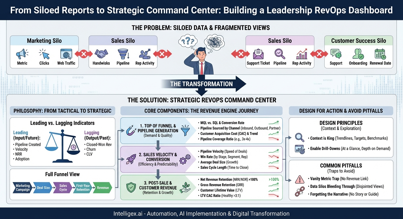
The Philosophy: From Tactical Metrics to Strategic Insights
Before diving into specific metrics, it’s crucial to understand the philosophical shift a RevOps dashboard represents. It’s a move away from simply tracking activity and toward measuring business impact. Every metric on a leadership dashboard should be able to answer the critical question: “So what?”
Leading vs. Lagging Indicators
A common mistake is to build dashboards that are overloaded with lagging indicators. These are output-oriented metrics that measure past performance, like a quarterly revenue report. While essential for accounting, they tell you what has already happened, giving you no time to influence the outcome.
- Lagging Indicators: Closed-Won Revenue, Customer Churn Rate, Customer Lifetime Value (CLV).
- Leading Indicators: Sales Pipeline Created, Pipeline Velocity, Net Revenue Retention (NRR), Product Adoption Rates.
A powerful RevOps dashboard for leadership maintains a healthy balance. It uses lagging indicators to confirm long-term trends and validate strategy, but it heavily emphasizes leading indicators. These are input-oriented metrics that offer predictive insight into future performance. A sudden drop in new pipeline creation is a leading indicator that revenue will likely miss its target in the next quarter. Seeing this early allows leadership to ask proactive questions and deploy resources to correct the course before it’s too late.
The Full Funnel View
The core principle of RevOps is to break down the silos between marketing, sales, and customer success. Your dashboard must reflect this unified approach. Instead of separate tabs or reports, it should present a seamless, end-to-end view of the customer journey. This allows leaders to see how an initiative at the top of the funnel (e.g., a new marketing campaign) impacts metrics downstream (e.g., deal size, sales cycle length, and even first-year retention). This holistic view is where true strategic insights are born, revealing points of friction and opportunities for optimization that would be invisible in a siloed view.
Core Components of a Leadership RevOps Dashboard
While every business is unique, a high-impact RevOps dashboard for leadership typically revolves around a few key areas that represent the entire revenue engine. Think of it as a journey from prospect to advocate, with key health checks along the way.
1. Top of Funnel & Pipeline Generation
This section answers the question: “Are we building enough high-quality demand to hit our future goals?” It connects marketing efforts directly to sales outcomes, focusing on efficiency and quality, not just volume.
- Marketing Qualified Leads (MQLs) vs. Sales Qualified Leads (SQLs): Tracks the volume of leads and, more importantly, the conversion rate between them. A low MQL-to-SQL conversion rate can be a leading indicator of poor lead quality or a misalignment between marketing and sales.
- Pipeline Sourced by Channel: Shows where your most valuable opportunities are coming from (e.g., inbound, outbound, partners). This helps leaders make strategic decisions about where to invest marketing and sales resources.
- Customer Acquisition Cost (CAC): The total cost of sales and marketing to acquire a single new customer. This is a fundamental measure of the go-to-market engine’s efficiency. It should be tracked over time and benchmarked against industry standards.
- Pipeline Coverage Ratio: This measures the value of your open pipeline against your revenue target for a given period (e.g., 3x or 4x coverage). It’s a critical leading indicator of your ability to hit future revenue goals.
2. Sales Velocity & Conversion
Once pipeline is created, this section answers: “How efficiently are we converting opportunities into revenue?” It focuses on the health, speed, and predictability of the sales process.
- Pipeline Velocity: A crucial compound metric that calculates how quickly deals are moving through the pipeline to become revenue. The formula is often: (Number of Opportunities x Average Deal Size x Win Rate) / Length of Sales Cycle. Increasing velocity is one of the most powerful levers for accelerating growth.
- Win Rate (by stage, segment, rep): What percentage of opportunities are we winning? Analyzing this by different segments can reveal where your team is most effective and where coaching or strategic changes are needed.
- Average Deal Size: Are we growing the value of our customer relationships? Tracking this over time can signal the success of up-sell/cross-sell initiatives or a move upmarket.
- Sales Cycle Length: How long does it take to close a deal? A lengthening sales cycle can indicate new friction in the buying process, competitive pressure, or an inefficient sales motion.
3. Post-Sale & Customer Revenue
This section is often the most overlooked but is arguably the most important for sustainable growth. It answers: “Are we retaining and growing our customer base effectively?” In a subscription economy, this is where profitability lives.
- Net Revenue Retention (NRR) or Net Dollar Retention (NDR): This is the single most important metric for many SaaS businesses. It measures revenue from an existing cohort of customers, accounting for both churn (lost revenue) and expansion (upgrades, cross-sells). An NRR over 100% means your business grows even without acquiring a single new customer.
- Gross Revenue Retention (GRR): This isolates customer and revenue churn without including expansion. It’s a pure measure of your ability to retain customers and their original contract value.
- Customer Lifetime Value (LTV): A prediction of the net profit attributed to the entire future relationship with a customer. A rising LTV is a sign of a healthy, sticky product and a strong customer relationship.
- LTV:CAC Ratio: This powerful ratio compares the lifetime value of a customer to the cost of acquiring them. A healthy ratio (often cited as 3:1 or higher) indicates a sustainable and profitable growth model.
Designing for Action, Not Just Observation
The design and presentation of the dashboard are as important as the metrics themselves. A cluttered or confusing dashboard will go unused. The key is to guide the user’s eye to what matters most and enable further exploration.
Context is King
A number without context is meaningless. Is a 75% win rate good or bad? It depends. Every key metric on a leadership dashboard should be presented with context:
- Trendlines: Show performance over time (e.g., week-over-week, month-over-month, quarter-over-quarter) to identify trends.
- Targets/Goals: Compare the actual metric against the planned goal to immediately see if you are on or off track.
- Benchmarks: Where possible, compare metrics to industry benchmarks or past performance (e.g., “YoY Growth”).
Enable Drill-Downs
The main leadership view should be clean and high-level. However, it should allow for exploration. A leader might see that the overall win rate has dropped. They should be able to click on that metric to see a breakdown—perhaps by region, by new vs. existing business, or by product line—to start diagnosing the root cause. This “at a glance, with depth on demand” approach keeps the dashboard from becoming an overwhelming wall of numbers while still providing the necessary detail for investigation.
Common Pitfalls to Avoid
Building an effective RevOps dashboard is an iterative process. Along the way, it’s easy to fall into a few common traps.
The Vanity Metric Trap
Avoid metrics that look good on paper but don’t correlate with revenue outcomes. Website traffic, social media followers, or number of demos conducted are all examples of metrics that can be easily manipulated and often don’t tell a story of business health. Every metric should have a clear and direct link to the revenue engine.
Data Silos Bleeding Through
A symptom of a poor RevOps dashboard is when it looks like three separate dashboards (marketing, sales, CS) stapled together. Ensure your metrics are truly cross-functional. For example, instead of just showing “MQLs” and “Closed-Won Deals,” show “MQL-to-Close Conversion Rate” and “Pipeline Sourced by Marketing Campaign.” This forces a unified view of performance.
Forgetting the Narrative
Finally, a dashboard should tell a story. Don’t just present the numbers; guide the interpretation. Use color-coding (red, yellow, green) to indicate performance against goals. Organize the layout to follow the customer journey logically. The goal is that within 60 seconds, any leader can look at the dashboard and understand the main story: where the business is winning, where it’s struggling, and where the biggest opportunities or risks lie.
Ultimately, a RevOps dashboard is more than a reporting tool. It is a strategic asset that creates alignment across the executive team. It standardizes the language of growth, focuses conversations on the most impactful levers, and replaces gut-feel decisions with data-informed strategy. By focusing on a balanced set of leading and lagging indicators that span the entire customer lifecycle, you can transform your data from a confusing liability into your most powerful tool for driving predictable, sustainable revenue growth.
Your Next Read:
Category:
Get a FREE
Proof of Concept
& Consultation
No Cost, No Commitment!