In the world of digital marketing, data is king. But a kingdom of data without order is chaos. We’re flooded with analytics from dozens of platforms, each screaming for our attention. Website traffic, social media engagement, ad spend, lead counts—the list is endless. This is where a well-structured marketing dashboard transforms from a simple reporting tool into a strategic command center. It’s not about tracking every possible metric; it’s about tracking the right metrics in the right order. The most powerful way to achieve this is by aligning your dashboard with the customer journey, telling a clear story from initial awareness to final conversion.
The marketing funnel provides the perfect narrative structure. By organizing your key performance indicators (KPIs) into the stages of Awareness, Consideration, and Conversion, you can instantly see how your efforts at the top of the funnel are translating into results at the bottom. This approach helps you diagnose problems, identify opportunities, and make data-driven decisions that move the needle. Let’s break down the essential metrics you need to build a dashboard that provides clarity, not confusion.
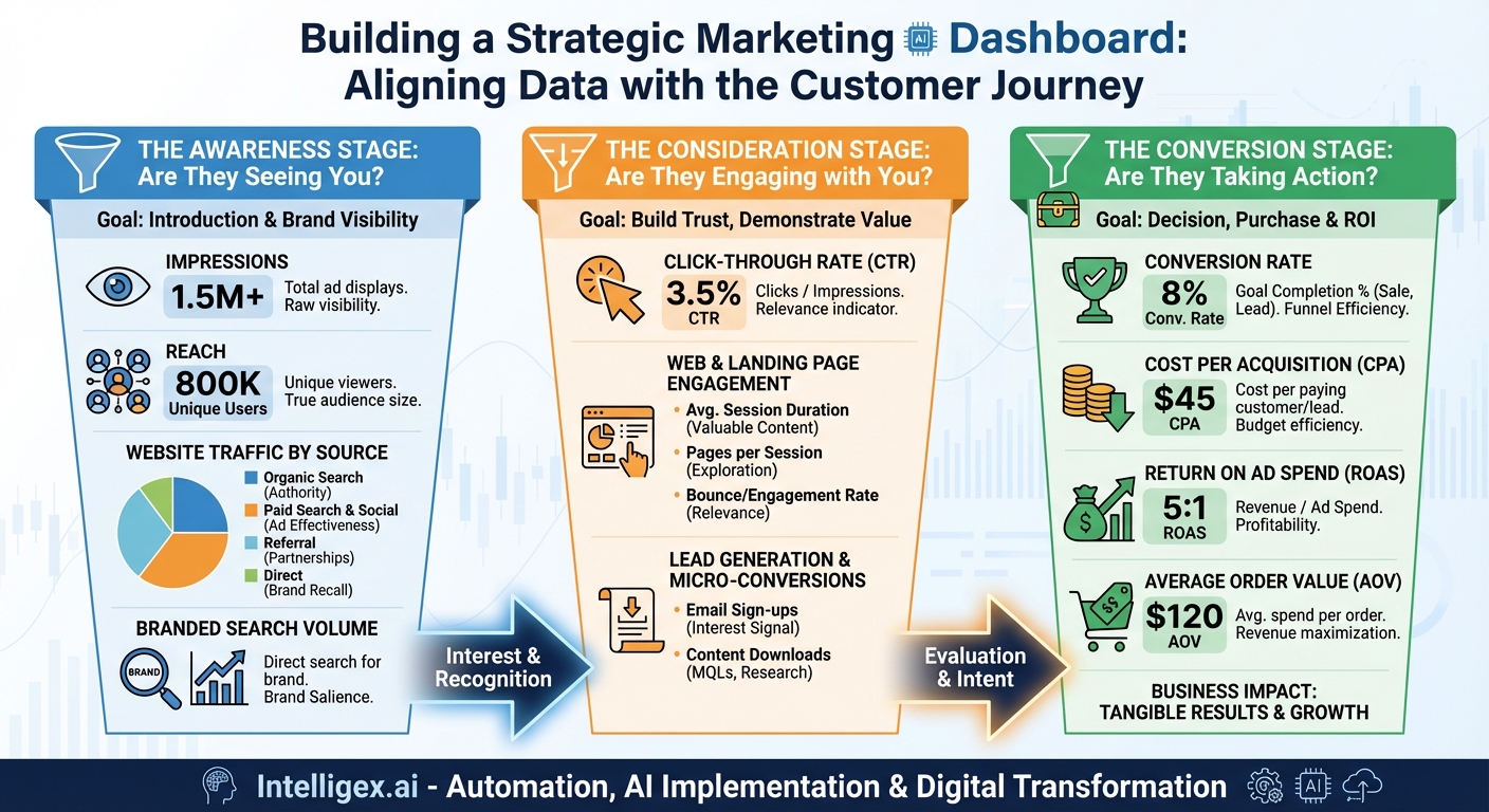
The Awareness Stage: Are They Seeing You?
This is the top of your funnel (TOFU). The primary goal here isn’t to make a sale; it’s to make an introduction. You’re casting a wide net to capture the attention of your target audience, introducing your brand, and planting a seed of recognition. The metrics in this stage measure your reach and visibility. They answer the fundamental question: “Is our target market finding out that we exist?”
Impressions
Impressions represent the total number of times your content (an ad, a social media post, a search result) has been displayed on a screen. It’s the most basic measure of visibility. While it doesn’t confirm that someone actually paid attention, it’s a critical starting point. High impression counts indicate that your content is being served frequently by the platform’s algorithm, whether it’s Google, Facebook, or LinkedIn. Think of it as the digital equivalent of foot traffic past your storefront window. It’s the potential for an audience, the raw material for all subsequent engagement.
Reach
While often confused with impressions, Reach is a distinct and arguably more important metric. Reach measures the number of unique people who have seen your content. If one person sees your ad five times, that counts as five impressions but only one in reach. Reach tells you the true size of your audience. If your goal is to introduce your brand to as many new people as possible, maximizing reach is paramount. A campaign with high impressions but low reach means you’re repeatedly showing your content to the same small group of people, which can lead to ad fatigue and wasted spend.
Website Traffic by Source
Your website is your digital home, and traffic is the measure of how many people are walking through the door. But not all traffic is created equal. A crucial part of your awareness dashboard is segmenting this traffic by its source. This tells you which channels are most effective at driving new visitors.
- Organic Search: Visitors who find you through a search engine like Google. This is a strong indicator of your brand’s authority and SEO effectiveness.
- Paid Search & Social: Visitors who click on your paid advertisements. This directly measures the top-of-funnel effectiveness of your ad campaigns.
- Referral: Visitors who come from a link on another website. This shows the power of your PR, backlinking, and partnership efforts.
- Direct: Visitors who type your URL directly into their browser. This often indicates strong brand recall—a major win for awareness.
Branded Search Volume
This is a powerful, often overlooked, awareness metric. Branded Search Volume is the number of times people search for your specific brand name or product names. An increasing trend in branded search volume is a fantastic sign that your top-of-funnel activities are working. People have seen your ads, heard about you from a friend, or read about you in an article, and are now actively seeking you out. It’s a direct measure of brand salience and a leading indicator of future direct and organic traffic.
The Consideration Stage: Are They Engaging with You?
Once someone is aware of your brand, they move into the consideration stage, or the middle of the funnel (MOFU). Here, they know who you are, and now they’re trying to figure out if you’re the right solution for their needs. They are actively researching, comparing, and evaluating. Your goal is to build trust, demonstrate value, and encourage deeper engagement. The metrics in this stage measure how effectively you’re capturing and holding your audience’s interest.
Click-Through Rate (CTR)
Click-Through Rate (CTR) is the percentage of people who saw your content (impressions) and then clicked on it. It’s calculated as (Clicks / Impressions) x 100. CTR is a primary measure of relevance. It tells you how compelling your ad copy, creative, or headline is. A low CTR suggests a disconnect: your content is being shown to people, but it’s not resonating enough to earn a click. A high CTR, on the other hand, means your messaging is hitting the mark with your target audience, successfully moving them from awareness to consideration.
Website & Landing Page Engagement Metrics
Once a user clicks through to your website, their behavior tells you a story. Key engagement metrics help you understand their level of interest.
- Average Session Duration: This measures the average amount of time a visitor spends on your site during a single session. A longer duration generally indicates that the content is valuable and engaging, keeping the user interested enough to stick around.
- Pages per Session: This metric tracks the average number of pages a user visits before leaving. A higher number suggests the user is exploring your site, digging deeper for more information, and is more invested than someone who visits a single page.
- Bounce Rate: Traditionally, this is the percentage of visitors who land on your site and leave without taking any further action, like clicking a link or visiting a second page. A high bounce rate can indicate that the landing page wasn’t relevant to the ad they clicked, the user experience is poor, or the content didn’t meet their expectations. Note: Google Analytics 4 is shifting focus to “Engagement Rate,” which is a more positive measure of meaningful interactions.
Lead Generation & Micro-Conversions
The consideration stage is where you start collecting leads. These aren’t final sales, but they are crucial “micro-conversions” that signal a high level of interest. Tracking these is vital for understanding your pipeline.
- Email Newsletter Sign-ups: When someone voluntarily gives you their email address, they are explicitly saying, “I want to hear more from you.” This is a strong indicator of interest and a direct entry point into your nurturing campaigns.
- Content Downloads: Offering valuable content like an e-book, a whitepaper, or a case study in exchange for contact information is a classic MOFU strategy. The number of downloads for these assets shows how many people are actively researching solutions and view you as a credible source of information. These are often classified as Marketing Qualified Leads (MQLs).
The Conversion Stage: Are They Taking Action?
This is the bottom of the funnel (BOFU), where consideration turns into decision. The user is ready to act, whether that means making a purchase, requesting a demo, or signing up for a trial. The metrics at this stage are all about performance and efficiency. They directly measure the return on your marketing investment and answer the all-important question: “Are our marketing efforts generating tangible business results?”
Conversion Rate
The Conversion Rate is the undisputed champion of BOFU metrics. It’s the percentage of visitors or leads who complete a desired goal (a “conversion”). This goal could be a sale, a form submission, or a free trial sign-up. Calculated as (Number of Conversions / Total Visitors or Clicks) x 100, this metric is the ultimate measure of how effectively your marketing and website are persuading users to take the final step. A low conversion rate, despite healthy traffic and engagement, points to a problem in the final stages of your funnel, such as your pricing, your offer, or your checkout process.
Cost Per Acquisition (CPA)
Also known as Cost Per Conversion, CPA measures the total cost of acquiring a single paying customer or lead through a specific campaign or channel. It’s calculated by dividing the total cost of a campaign by the number of conversions it generated. CPA tells you exactly how much you’re spending to get a result. This metric is essential for budget allocation and profitability analysis. If your CPA is higher than the lifetime value of a customer, your marketing strategy is not sustainable.
Return on Ad Spend (ROAS)
For e-commerce and any business that can directly attribute revenue to advertising, ROAS is a critical measure of profitability. It’s calculated by dividing the total revenue generated from an ad campaign by the amount spent on that campaign. A ROAS of 5:1, for example, means that for every $1 you spent on advertising, you generated $5 in revenue. ROAS provides a clear, unambiguous link between ad spend and top-line revenue, making it a favorite metric for demonstrating marketing’s financial impact.
Average Order Value (AOV)
Average Order Value (AOV) tracks the average dollar amount spent each time a customer places an order. While not a direct conversion metric itself, it provides crucial context. You can increase revenue in two ways: by increasing your number of conversions or by increasing the amount each customer spends. By tracking AOV, you can identify opportunities for upselling, cross-selling, or product bundling strategies designed to increase the value of each conversion, which can dramatically improve your overall profitability and ROAS.
Bringing It All Together: From Data Points to a Cohesive Story
A dashboard is more than a list of the metrics above. A truly strategic dashboard arranges them in a logical flow—Awareness on the left, Consideration in the middle, and Conversion on the right. This visual narrative allows you to see how performance at one stage impacts the next. You can immediately spot bottlenecks. Are you getting tons of impressions but a terrible CTR? Your awareness targeting might be off, or your ad creative isn’t compelling. Is your website traffic high but your lead generation low? Your on-site content might not be engaging enough. Do you have plenty of leads but a low conversion rate? There could be friction in your sales or checkout process.
By building your dashboard around the customer journey, you move beyond isolated data points and start to understand the holistic performance of your marketing engine. You can see the story of your customers unfold in the data, from their first glance at your brand to their final, confident click to buy. This is the power of a well-crafted marketing dashboard: it transforms chaos into clarity and empowers you to build a better journey for your customers and better results for your business.
Your Next Read:
Category:
Get a FREE
Proof of Concept
& Consultation
No Cost, No Commitment!