

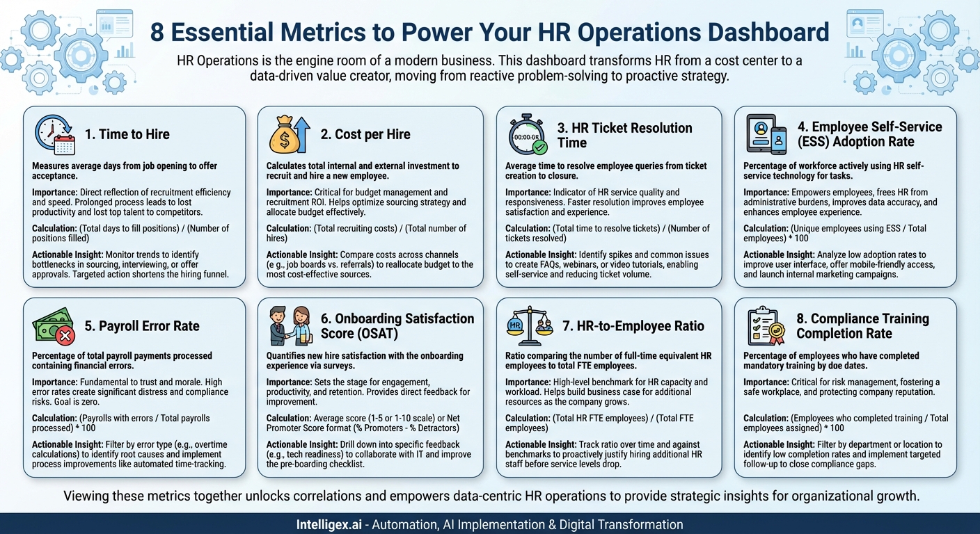
In the modern business landscape, the Human Resources department has evolved far beyond its traditional administrative role. Today, HR is a strategic partner, pivotal in shaping company culture, driving employee engagement, and ultimately, influencing the bottom line. At the core of this transformation lies HR Operations—the engine room that ensures all HR processes run smoothly, efficiently, and effectively. But how can you be sure your engine is performing at its peak? The answer lies in data, and the best way to visualize that data is through a well-designed HR Operations Dashboard.
An HR Operations Dashboard is a business intelligence tool that provides a real-time, at-a-glance view of key performance indicators (KPIs) related to the day-to-day functions of the HR department. Unlike a strategic dashboard that might focus on long-term talent pipelines or succession planning, an operational dashboard hones in on the efficiency, quality, and speed of core HR services. It’s about answering the “how”—how well are we recruiting, how quickly are we resolving employee issues, and how efficiently are we managing our core processes?
By tracking the right metrics, HR leaders can move from reactive problem-solving to proactive strategy, identifying bottlenecks before they become crises, justifying resource allocation with hard numbers, and demonstrating the tangible value of their function to the wider organization. Here are eight essential metrics that every robust HR Operations Dashboard should include to start this data-driven journey.
1. Time to Hire
What it is: Time to Hire measures the average number of days between the moment a job requisition is opened and a candidate accepts the formal offer. It is a fundamental measure of recruiting efficiency.
Why it’s important: This metric is a direct reflection of your recruitment process’s health and speed. A lengthy Time to Hire can have significant consequences. It can lead to lost productivity as roles remain vacant for extended periods. Furthermore, in a competitive talent market, the best candidates are often off the market within a matter of weeks. A slow process means you risk losing top talent to nimbler competitors. Tracking this metric helps you identify bottlenecks—is it the sourcing stage, the interview scheduling, or the offer approval process that’s causing delays? By monitoring trends, you can take targeted action to streamline your hiring funnel.
How to calculate it:
(Total days taken to fill all positions in a period) / (Number of positions filled in that period)
Actionable Insight: Your dashboard shows that the average Time to Hire has crept up by 15% over the last quarter, specifically for senior-level tech roles. Digging deeper, you find the delay is at the final interview stage with leadership. This insight allows you to work with senior managers to set clear expectations on interview availability and feedback turnaround times, directly addressing the bottleneck and shortening the cycle for future hires.
2. Cost per Hire
What it is: Cost per Hire calculates the total investment made to recruit and hire a new employee. This includes both internal costs (recruiter salaries, time spent by hiring managers) and external costs (job board fees, agency fees, advertising, background checks).
Why it’s important: This is a critical metric for budget management and for understanding the return on investment (ROI) of your recruitment efforts. It helps you answer vital questions: Are we spending our recruitment budget effectively? Which sourcing channels provide the best candidates for the lowest cost? A high Cost per Hire might indicate an over-reliance on expensive recruitment agencies or inefficient advertising spend. By tracking this, HR can make data-backed decisions to optimize its sourcing strategy, perhaps by investing more in a high-performing, low-cost employee referral program.
How to calculate it:
(Total internal and external recruiting costs) / (Total number of hires in a specific period)
Actionable Insight: Your dashboard reveals that while a premium industry job board accounts for 30% of your recruiting spend, it only yields 5% of your successful hires. In contrast, your employee referral program costs almost nothing but accounts for 40% of new hires who also have a higher retention rate. This data provides a clear case to reallocate budget from the ineffective job board to enhancing your referral bonus program.
3. HR Ticket Resolution Time
What it is: This metric measures the average time it takes for the HR team to successfully resolve an employee query or request, from the moment a “ticket” is created in your HR service delivery system to when it is marked as closed.
Why it’s important: HR Ticket Resolution Time is a direct indicator of your HR team’s service quality and responsiveness. For employees, having a question about their pay, benefits, or leave is important and often time-sensitive. Long waiting times lead to frustration, disengagement, and a perception that HR is unhelpful. Monitoring this metric helps you manage team workload, identify common issues that could be addressed with better communication or self-service tools, and pinpoint areas where HR staff may need additional training.
How to calculate it:
(Total time taken to resolve all tickets in a period) / (Number of tickets resolved in that period)
Actionable Insight: The dashboard highlights that the average resolution time for benefits-related questions spikes dramatically during the open enrollment period each year. This operational insight prompts the team to proactively develop a more comprehensive FAQ document, host pre-enrollment webinars, and create short video tutorials, all aimed at preemptively answering common questions and reducing the ticket volume for the next cycle.
4. Employee Self-Service (ESS) Adoption Rate
What it is: This metric calculates the percentage of your total workforce that actively uses your HR self-service technology (like an HRIS portal) to perform tasks such as updating personal information, requesting time off, accessing payslips, or enrolling in benefits.
Why it’s important: In the digital age, empowering employees to manage their own HR-related tasks is crucial for operational efficiency. A high ESS adoption rate means your HR professionals are freed from time-consuming administrative burdens and can focus on more strategic, value-added work. It also improves data accuracy, as employees are directly responsible for their own information, and enhances the employee experience by providing instant access to information. A low adoption rate might signal that the technology is not user-friendly, employees are not aware of its capabilities, or they haven’t been properly trained.
How to calculate it:
(Number of unique employees actively using ESS in a period / Total number of employees) * 100
Actionable Insight: Your dashboard shows an ESS adoption rate of only 45%. After sending out a quick poll, you discover that many employees find the mobile interface confusing. This leads you to work with your vendor to improve the mobile user experience and launch a targeted internal marketing campaign showcasing the “on-the-go” benefits of the mobile app, subsequently boosting the adoption rate.
5. Payroll Error Rate
What it is: The Payroll Error Rate is the percentage of total payroll payments processed that contain a financial error, such as incorrect salary, wrong tax deductions, or missed overtime payments.
Why it’s important: Getting pay right is arguably the most fundamental operational responsibility of HR. It is the bedrock of trust between an employee and the company. Even small, infrequent errors can cause significant employee distress, damage morale, and erode confidence in the organization. A high error rate can also create serious compliance and legal risks. Tracking this metric with a goal of zero is non-negotiable. It helps identify the root causes of mistakes, whether they stem from manual data entry, complex commission structures, or issues with timesheet submissions.
How to calculate it:
(Number of payrolls processed with errors in a period / Total number of payrolls processed in that period) * 100
Actionable Insight: You notice a small but consistent payroll error rate of 2% each month. The dashboard allows you to filter by error type, revealing that over 80% of these errors are related to incorrect overtime calculations for hourly employees. This points to a clear process problem. In response, you implement a new automated time-tracking system and provide clearer training for managers on how to approve overtime, leading to a near-elimination of that error type.
6. Onboarding Satisfaction Score (OSAT)
What it is: This metric quantifies how new hires feel about their onboarding experience. It is typically captured through surveys administered at the end of the first week, 30 days, or 90 days, asking new employees to rate various aspects of the process (e.g., pre-arrival communication, IT setup, clarity of role, introduction to the team).
Why it’s important: The onboarding process is your organization’s first, best chance to make a lasting positive impression. A great onboarding experience sets the stage for higher engagement, faster time-to-productivity, and improved long-term retention. A poor experience can leave new hires feeling confused, isolated, and questioning their decision to join. The OSAT score provides direct feedback on this critical operational process, showing you what’s working and what needs immediate improvement.
How to calculate it:
This is often an average score from a survey using a 1-5 or 1-10 scale, or it can be a Net Promoter Score (NPS) format: (% Promoters – % Detractors).
Actionable Insight: The overall OSAT score is a strong 8.5/10, but the dashboard shows a dip to 5/10 for the question related to “readiness of technology and equipment on day one.” This specific feedback allows HR Operations to collaborate with the IT department to create a more robust pre-boarding checklist, ensuring every new hire’s laptop, software, and system access are fully prepared before they even walk in the door.
7. HR-to-Employee Ratio
What it is: A straightforward ratio that compares the number of full-time equivalent (FTE) HR employees to the total number of FTE employees in the organization.
Why it’s important: This metric serves as a high-level benchmark for the capacity and workload of your HR function. While there’s no single “perfect” ratio—it varies by industry, company size, and level of automation—tracking your own ratio over time is invaluable. If your company is growing rapidly but the ratio is becoming increasingly stretched (e.g., going from 1:75 to 1:150), it provides a powerful data point to build a business case for hiring additional HR staff. It helps ensure the HR team is adequately resourced to provide effective operational support without burning out.
How to calculate it:
(Total number of FTE HR employees) / (Total number of FTE employees)
Actionable Insight: Your company plans to increase its headcount by 40% over the next year. Your HR Operations Dashboard shows the current HR-to-Employee ratio is already at the high end of your industry’s benchmark. By presenting this data, you can proactively make the case to leadership that to support this growth effectively, the HR team needs to grow by at least two people, preventing a future scenario where service levels drop due to an unsustainable workload.
8. Compliance Training Completion Rate
What it is: This metric tracks the percentage of employees who have completed mandatory training modules (e.g., anti-harassment, data security, workplace safety, code of conduct) by their assigned due dates.
Why it’s important: From an operational and risk management perspective, this metric is critical. Ensuring timely completion of compliance training is not just about ticking a box; it’s about mitigating legal and financial risk, fostering a safe and ethical workplace, and protecting the company’s reputation. A dashboard that visualizes this data—and allows you to filter by department, location, or course—transforms it from a cumbersome spreadsheet exercise into a proactive risk management tool. It highlights problem areas immediately, allowing for targeted intervention.
How to calculate it:
(Number of employees who completed required training) / (Total number of employees assigned the training) * 100
Actionable Insight: The overall compliance training completion rate is 98%, which looks great. However, your dashboard allows you to drill down, revealing that the completion rate for the new GDPR data privacy training is only 60% within the sales department. This discovery triggers immediate, targeted follow-up with sales leadership to emphasize the importance of the training and enforce its completion, closing a significant compliance gap before it becomes an issue.
An HR Operations Dashboard, powered by these eight metrics, transforms your function from a cost center into a data-driven value creator. It replaces guesswork with evidence, gut feelings with clear trends, and subjective anecdotes with objective facts. The true power emerges when you view these metrics together, identifying correlations and understanding how a change in one area impacts another. By embracing this data-centric approach, HR operations teams can not only perfect their own processes but also provide the strategic insights needed to help the entire organization thrive.
Your Next Read:
Category:
Get a FREE
Proof of Concept
& Consultation
No Cost, No Commitment!