Procurement is often the circulatory system of a business, moving essential resources to every department. Yet for many organizations, it operates in a black box. Critical data is fragmented across spreadsheets, email chains, and disconnected software, making it nearly impossible to answer fundamental questions quickly. How much are we spending with our top suppliers? Are we on budget for the quarter? Which contracts are up for renewal? Answering these requires days of manual data wrangling, and by the time you have the answer, it’s often too late to act.
This lack of visibility creates tangible business problems: uncontrolled “maverick” spending, missed cost-saving opportunities, and supply chain risks that go unnoticed until they disrupt operations. The solution is not more spreadsheets. It is a centralized, visual, and intuitive procurement dashboard. By bringing key data into a single view, you transform procurement from a reactive, administrative function into a strategic, proactive asset that drives efficiency, manages risk, and protects your bottom line.
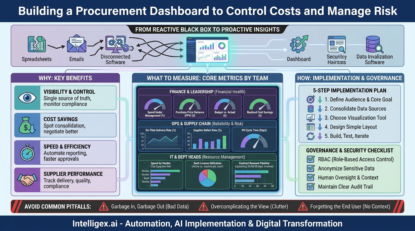
From Reactive to Proactive: The Purpose of a Procurement Dashboard
At its core, a procurement dashboard is a business intelligence tool that provides a real-time, at-a-glance view of your company’s purchasing activities. It consolidates data from various sources like your Enterprise Resource Planning (ERP) system, accounting software, and contract management platforms, then presents it through easy-to-understand charts, graphs, and key performance indicators (KPIs).
The fundamental goal is to shift your team from digging for information to having insights delivered to them. Instead of spending hours compiling reports to find out what happened last month, a manager can see what is happening right now and make informed decisions on the spot. This shift delivers value across several key areas:
- Visibility and Control: It provides a single source of truth for all procurement-related activities. This centralized view helps identify non-compliant spending, monitor budget adherence, and ensure purchasing policies are being followed across the organization.
- Cost Savings: By highlighting spending patterns, a dashboard makes it easier to spot opportunities for vendor consolidation, negotiate volume discounts, and track the success of cost-saving initiatives. You can easily compare pricing across similar items or services from different suppliers.
- Speed and Efficiency: It automates the reporting process, freeing up your finance and procurement teams from tedious manual work. Approvals can be faster when managers have instant access to budget and supplier context, reducing the overall purchase-to-pay cycle time.
- Supplier Performance Management: Dashboards help you move beyond cost as the only metric for evaluating suppliers. You can track critical performance data like on-time delivery rates, quality or defect rates, and compliance with contract terms, enabling more strategic supplier relationships.
Choosing What to Measure: Core Metrics for Every Team
A common mistake is trying to display every possible metric on a single dashboard. This creates a cluttered and confusing interface that users will quickly abandon. The most effective dashboards are tailored to the specific needs and goals of their audience. Start by asking, “What are the one or two questions this user needs to answer to do their job better?”
Here are some examples of practical metrics, broken down by the teams that rely on them most.
For Finance and Leadership
The finance team needs a high-level view of financial health and compliance. Their dashboard should focus on budget control and overall spend efficiency.
- Spend Under Management: The percentage of total company spend that is actively managed by the procurement process. A higher percentage indicates better control.
- Purchase Price Variance (PPV): The difference between the standard or budgeted cost of an item and the actual amount paid. This is a direct measure of procurement’s effectiveness in negotiating prices.
- Budget vs. Actual Spend: A real-time comparison of spending against allocated budgets, often broken down by department, project, or cost center.
- Realized Cost Savings: The tangible savings achieved through negotiations, vendor consolidation, or process improvements, tracked against a baseline.
For Operations and Supply Chain
This team is focused on operational continuity and supplier reliability. Their dashboard must provide insights into the performance and risk associated with the supply base.
- On-Time Delivery Rate: The percentage of orders delivered by the agreed-upon date. A declining rate is an early warning sign of potential disruptions.
- Supplier Defect Rate: The percentage of units or services that fail to meet quality standards. This is a critical indicator of supplier quality and reliability.
- Purchase Order (PO) Cycle Time: The average time from when a purchase requisition is created to when the PO is sent to the supplier. A long cycle time can delay projects and operations.
For IT and Department Heads
Departmental leaders need visibility into their specific areas of spend to manage budgets and resources effectively. For an IT department, this is often about software, hardware, and services.
- Spend by Vendor: A clear breakdown of which suppliers receive the most spend, which is crucial for identifying consolidation opportunities (e.g., with cloud providers like AWS or software vendors).
- SaaS License Utilization: Tracking active versus inactive licenses for subscription software to eliminate wasted spend on “shelfware.”
- Contract Renewal Pipeline: A forward-looking view of contracts expiring in the next 30, 60, or 90 days, providing adequate time for review and renegotiation.
Your First Dashboard: A 5-Step Implementation Plan
Building a procurement dashboard does not have to be a massive, multi-year project. By starting with a focused pilot, you can demonstrate value quickly and build momentum for a broader rollout. Follow these practical steps to get started.
- Define the Audience and a Single, Core Goal. Before you look at any data, identify who the primary user of this first dashboard will be. Is it the Head of Marketing? The IT Manager? Then, work with them to define the single most important question they need answered. For example, a marketing leader might need to know, “Are we on track with our quarterly freelance budget?” This narrow focus prevents scope creep and ensures the final product is immediately useful.
- Identify and Consolidate Your Data Sources. Where does the necessary information live? For our marketing example, you might need to pull budget data from the finance system, PO data from the ERP, and invoice data from accounts payable software. In the beginning, this may involve manually exporting data to a central spreadsheet. This step is often the most challenging, as it highlights data silos, but it is essential for creating a trustworthy dashboard.
- Choose Your Visualization Tool. You don’t need a complex or expensive tool for your first iteration. Many companies already have access to powerful business intelligence (BI) platforms like Microsoft Power BI or Tableau as part of existing software packages. Even a well-structured spreadsheet can serve as an initial proof of concept. The key is to select a tool that can connect to your data sources and create simple, clear visualizations.
- Design a Simple and Intuitive Layout. Less is more. Place the most important, top-level metric (the answer to your user’s core question) in a prominent position, typically the top-left corner. Use clear charts like bar graphs for comparisons, line charts for trends over time, and tables for detailed drill-downs. Avoid using too many colors or complex chart types that require interpretation. The goal is for a user to understand the key message in five seconds or less.
- Build, Test, and Gather Feedback. Build a working prototype and put it in front of your target user. Watch how they interact with it. Are they confused by anything? Does it answer their question? Use their feedback to make immediate improvements. Dashboards are not static; they should be treated as living products that evolve based on user needs and changing business priorities.
Common Pitfalls That Derail Dashboard Projects
Many dashboard initiatives fail to deliver on their promise. They end up as complex, unused tools that took months to build. Awareness of common pitfalls can help you avoid this outcome and ensure your project delivers lasting value.
Pitfall 1: “Garbage In, Garbage Out.” A dashboard is only as reliable as the data that feeds it. If your source systems contain inaccurate, incomplete, or inconsistent data (e.g., supplier names entered differently across systems), your dashboard will simply visualize those errors, eroding user trust. Before you build, conduct a basic data quality audit. Establish clear data entry standards and a process for cleaning and validating information at the source.
Pitfall 2: Overcomplicating the View. The temptation is to cram every possible piece of data onto a single screen. This results in a “data vomit” dashboard that is overwhelming and impossible to use. A good dashboard tells a story and guides the user toward an insight. Stick to a limited number of well-chosen metrics that are directly related to the user’s goals. If more detail is needed, allow users to drill down to a separate, more detailed view.
Pitfall 3: Forgetting the End User. Too often, dashboards are designed by a technical team with little input from the business users who will depend on them. This leads to a tool that is technically impressive but practically useless. Involve your end users from the very beginning, starting with the initial goal-setting session and continuing through testing and iteration. Their context and daily needs are the most important design constraints.
Building with Confidence: Data Governance and Security
A procurement dashboard concentrates sensitive business information into one place, making data governance and security paramount. As you provide easier access to data, you must also ensure that access is appropriate and secure. A failure to do so can expose confidential pricing, supplier relationships, or budget information, creating significant business risk.
Implementing a simple governance framework from the start is not optional. It builds trust and ensures the long-term viability of your analytics initiatives.
A short checklist for safe dashboard implementation includes:
- Implement Role-Based Access Control (RBAC). Not everyone needs to see everything. Define user roles with specific permissions. For example, a department manager should only see their own team’s spend data, while a C-level executive can see an aggregated, company-wide view. This principle of least privilege is a cornerstone of data security.
- Anonymize or Omit Sensitive Data. Review all data fields to ensure you are not unnecessarily exposing Personally Identifiable Information (PII) or other sensitive data. For instance, a dashboard tracking contractor spend does not need to show an individual’s home address or personal contact details.
- Ensure Human Oversight and Context. A dashboard is a tool to support decision-making, not replace it. Train users to interpret the data correctly and to understand its limitations. Encourage them to see the dashboard as a starting point for inquiry, one that should be combined with their professional experience and business context before taking action. An automated alert about a supplier’s poor performance should trigger a conversation, not an automatic termination.
- Maintain a Clear Audit Trail. Your BI tool should be able to log who is accessing which data and when. This is critical for security audits and for troubleshooting any data discrepancies that may arise.
Your Action Plan for Better Procurement Visibility
Gaining control over your procurement data is a journey, not a single event. The key is to start small, prove value, and build incrementally. A comprehensive, all-encompassing dashboard project is likely to fail under its own weight. A series of small, targeted wins is far more effective.
Here are your immediate next steps to move from concept to reality:
- Identify One Pain Point. Schedule a 30-minute conversation with a stakeholder in Finance, Operations, or another key department. Ask them: “What is the one piece of procurement information you wish you had right now, but can’t easily get?”
- Choose One Metric. Based on that conversation, select a single, high-impact metric that directly addresses their pain point. Don’t boil the ocean; focus on delivering one valuable insight.
- Run a Manual Pilot. You don’t need a tool yet. Manually pull the data for that one metric into a simple spreadsheet chart. Update it weekly for one month and share it with your stakeholder. This low-cost pilot will prove the concept’s value and build support for a more robust solution.
- Create a Simple Roadmap. Once you’ve demonstrated value, outline a simple roadmap. What is the next logical metric to add? Which department should you engage next? This iterative approach ensures your dashboard evolves to meet real business needs, transforming your procurement process one insight at a time.
Your Next Read:
Category:
Get a FREE
Proof of Concept
& Consultation
No Cost, No Commitment!