In today’s volatile market, the supply chain is no longer a quiet, back-office function. It’s the central nervous system of your business, directly impacting everything from profit margins and cash flow to customer satisfaction and brand reputation. Yet, for many organizations, critical supply chain data remains trapped in spreadsheets, legacy systems, and disconnected reports. This creates a reactive environment where teams are constantly fighting fires instead of building a resilient, forward-looking operation.
A well-designed supply chain dashboard changes this dynamic. It’s not just about visualizing data; it’s about transforming that data into a shared source of truth that drives proactive, cross-functional decisions. It replaces gut feelings with evidence, enabling teams in Finance, Sales, and Operations to work from the same playbook. The ultimate goal is to build a supply chain that is not only efficient but also agile enough to adapt to whatever comes next.
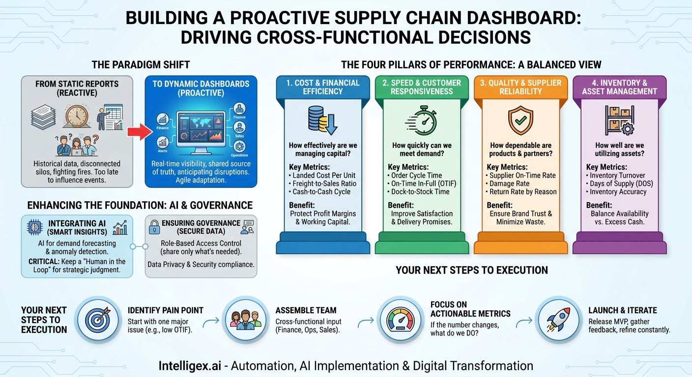
From Static Reports to Dynamic Decision-Making
The first step is to shift your mindset from historical reporting to real-time analysis. A traditional report tells you what happened last month or last quarter. It’s a snapshot in time, useful for review but often too late to influence current events. A dynamic dashboard, on the other hand, shows you what is happening right now and provides the insights needed to anticipate what might happen next.
This transition from reactive to proactive is where the true business value lies. When a dashboard flags a potential delay at a key port, your logistics team can begin rerouting shipments before they become stuck. When it shows a sudden spike in demand for a specific product, your procurement team can accelerate purchase orders to avoid a stockout. This agility has a ripple effect across the entire organization:
- Finance: Gains real-time visibility into cash-to-cash cycles and landed costs, enabling more accurate financial forecasting and working capital management.
- Sales: Can make more reliable delivery promises to customers based on accurate, up-to-the-minute inventory levels and production schedules.
- Operations: Can allocate labor and equipment more effectively by anticipating bottlenecks and surges in warehouse or manufacturing activity.
A dashboard isn’t a crystal ball, but it is the closest thing to a real-time map of your operational health, allowing you to navigate disruptions with confidence instead of surprise.
The Four Pillars of Supply Chain Performance
To avoid creating a dashboard that is cluttered and unactionable, it’s best to structure it around the four fundamental pillars of supply chain performance. These pillars provide a balanced view, ensuring you aren’t optimizing for cost at the expense of quality, or for speed at the expense of efficiency. A truly effective dashboard integrates metrics from all four areas to provide a holistic picture of your supply chain’s health and its impact on the business.
The four pillars are:
- Cost and Financial Efficiency: How effectively are you managing expenses and capital? This is the primary concern for your finance team and executives.
- Speed and Customer Responsiveness: How quickly and reliably can you meet customer demand? This directly impacts customer satisfaction and sales.
- Quality and Reliability: How consistent and dependable are your products, processes, and partners? This pillar is crucial for brand reputation and minimizing waste.
- Inventory and Asset Management: How well are you utilizing your physical and financial assets? This ensures capital isn’t tied up unnecessarily in stock.
By organizing your key metrics under these pillars, you create a dashboard that is intuitive for a wide range of stakeholders and tells a clear story about where your supply chain is excelling and where it needs attention.
Pillar 1: Tracking Cost and Financial Efficiency
Every decision in the supply chain has a financial consequence. A dashboard that clearly visualizes these costs is an indispensable tool for protecting your profit margins. It connects operational activities to the bottom line, making cost drivers transparent and manageable. Instead of waiting for a month-end report from accounting, teams can see the financial impact of their decisions as they happen.
What to Measure
- Landed Cost Per Unit: This is the total cost of a product on its journey from the factory to your warehouse. It includes manufacturing, transportation, customs, insurance, and handling fees. Tracking this reveals the true profitability of each product.
- Freight Cost to Sales Ratio: This metric shows what percentage of your revenue is spent on transportation. A rising ratio can be an early warning of eroding margins.
- Warehouse Operating Costs: Monitor costs related to labor, storage, and utilities per order or per unit. This helps identify inefficiencies in your fulfillment centers.
- Cash-to-Cash Cycle Time: The time it takes to convert your investments in inventory back into cash from sales. A shorter cycle means better working capital efficiency, a key metric for any CFO.
A Practical Scenario
Imagine your dashboard shows that the landed cost for a top-selling product has increased by 15% over the last two weeks. The alert is visible to both the supply chain team and the finance team. The supply chain manager investigates and finds that the increase is due to a surge in ocean freight spot market rates. Simultaneously, the finance team sees the potential impact on the product’s gross margin. Together, they can make an informed decision. They might temporarily switch to a closer supplier, absorb the cost for a short period to protect market share, or work with the sales team to adjust pricing. Without a shared, real-time view, this issue might only have been discovered weeks later, after significant financial damage was already done.
Pillar 2: Measuring Speed and Customer Responsiveness
In today’s market, speed is a competitive advantage. Customers expect fast, reliable delivery. Your ability to meet this expectation is directly tied to the efficiency of your order fulfillment process. This pillar focuses on metrics that measure your performance from the moment a customer places an order to the moment they receive it.
What to Measure
- Order Cycle Time: The average time elapsed from order placement to final delivery. Breaking this down into segments (e.g., order processing time, warehouse picking time, transit time) helps pinpoint bottlenecks.
- On-Time In-Full (OTIF): Perhaps the most important customer-facing metric. It measures what percentage of orders were delivered complete (no missing items) and on the date promised. A low OTIF score is a direct indicator of customer dissatisfaction.
- Dock-to-Stock Time: The time it takes for incoming goods to be received, processed, and made available for fulfillment. Long dock-to-stock times mean inventory is sitting idle and unavailable for sale.
Checklist for Improving OTIF
If your dashboard reveals a declining OTIF score, it’s a critical issue that requires a cross-functional response. Use this checklist to guide your investigation:
- Is inventory data accurate? Mismatches between your system and physical stock are a leading cause of incomplete orders. This is a problem for both IT and Operations to solve.
- Are warehouse processes a bottleneck? Analyze picking, packing, and shipping times. A delay here could indicate a need for process changes, new technology, or better labor planning.
- Is carrier performance meeting expectations? Your dashboard should track carrier pickup times and on-time delivery rates. If a specific carrier is underperforming, it’s time for a performance review.
- Are sales and marketing aligned on lead times? Ensure the delivery dates being promised to customers are realistic and based on current supply chain performance data.
Pillar 3: Ensuring Quality and Supplier Reliability
A fast and cheap supply chain is worthless if the product arrives damaged or is the wrong item. Quality and reliability are the foundation of customer trust and operational efficiency. Defects, damages, and supplier delays create waste, drive up costs, and hurt your brand. This pillar focuses on metrics that monitor the integrity of your products and the performance of your partners.
What to Measure
- Supplier On-Time Delivery Rate: Tracks how often your suppliers deliver goods by the agreed-upon date. Late deliveries from suppliers cause production delays and stockouts downstream.
- Damage Rate: Measures the percentage of products damaged during transit or within the warehouse. High rates can signal issues with packaging, handling procedures, or carrier choice.
- Customer Return Rate (by reason): It’s not enough to know how many items are returned. You need to know why. A dashboard should categorize returns by reason code (e.g., “damaged in transit,” “wrong item shipped,” “defective product”), pointing you to the root cause.
A Practical Scenario
A dashboard flags a spike in the customer return rate for “damaged in transit” originating from a specific distribution center. The operations manager initially suspects a problem with the outbound shipping carrier. However, by drilling down into the data, they see the damage reports are only for products handled by the warehouse’s second shift. This insight shifts the focus from an external partner to an internal process. The operations manager partners with HR to review training protocols and equipment for the second shift. They discover that a key piece of packing equipment is malfunctioning during that shift, leading to improperly secured packages. The issue was not the carrier, but an internal training and maintenance gap, which can now be fixed directly.
Pillar 4: Optimizing Inventory and Asset Management
Inventory is a double-edged sword. Too little, and you risk stockouts and lost sales. Too much, and you tie up valuable cash in products that are sitting on a shelf, incurring storage costs and risking obsolescence. Effective inventory management is a balancing act, and a dashboard is the tool that helps you maintain that balance. It provides the visibility needed to optimize stock levels across your entire network.
What to Measure
- Inventory Turnover: A ratio showing how many times your inventory is sold and replaced over a period. A higher turnover generally indicates efficient inventory management.
- Days of Supply (DOS): This shows how many days’ worth of inventory you have on hand based on current demand. It helps identify both the risk of stockouts (low DOS) and excess inventory (high DOS).
- Inventory Accuracy: The percentage match between your system’s inventory records and your physical stock. Low accuracy leads to stockouts, even when your system says you have units available.
- Carrying Cost of Inventory: The total cost of holding inventory, including storage, insurance, taxes, and obsolescence. This metric helps Finance understand the true cost of excess stock.
A Step-by-Step Process for Managing Excess Stock
When your dashboard flags a product with a high Days of Supply and low turnover, it triggers a clear, collaborative process to turn that dormant asset back into cash.
- Identify and Segment: The dashboard automatically flags SKUs that have exceeded a predefined DOS threshold (e.g., 120 days). The inventory planning team then segments this list, distinguishing between seasonal leftovers, slow-moving but core items, and potentially obsolete products.
- Collaborate with Commercial Teams: The inventory data is shared directly from the dashboard with the Sales and Marketing teams. They can see exactly how much excess stock exists and where it is located.
- Develop an Action Plan: Together, the teams decide on the best strategy. Can the excess stock be bundled with a faster-selling product? Can a targeted marketing promotion or a short-term discount clear the inventory?
- Execute and Monitor: The promotion is launched. The dashboard is then used to track the sell-through rate in real-time, allowing the teams to see if the plan is working and make adjustments as needed.
- Refine Future Forecasts: Once the excess is cleared, the data is used to adjust the demand forecast and purchasing parameters for that SKU, reducing the risk of future over-buying.
Integrating AI and Ensuring Data Governance
As you build out your dashboard, you can begin to incorporate more advanced analytics and artificial intelligence. However, it’s important to approach this practically. AI is not a magic solution; it is a tool to enhance the insights you get from your data. For example, AI models can analyze historical data and external factors (like weather patterns or public holidays) to generate more accurate demand forecasts. They can also power anomaly detection, automatically flagging a shipment that is behaving unusually and is at high risk of being delayed.
With this power comes responsibility. As you centralize sensitive supply chain data, strong governance becomes non-negotiable. This isn’t just an IT problem; it’s a business-critical function.
- Role-Based Access Control: Not everyone in the company should see every metric. A sales representative needs to see inventory availability, but not supplier contract pricing. A warehouse manager needs to see shift performance, but not the company’s overall profit margin. Implement strict, role-based permissions to ensure users only see the data relevant and necessary for their jobs.
- Data Privacy and Security: Your supply chain data includes information about customers and suppliers. This data must be handled in compliance with regulations like GDPR. Ensure your dashboard and underlying data platforms are secure and that data is anonymized wherever possible.
- Keep a Human in the Loop: AI can provide powerful recommendations, such as suggesting an alternative supplier or a rerouted shipping lane. However, the final decision should rest with a human expert who can apply business context and strategic judgment. The dashboard is a decision-support tool, not an autonomous decision-maker. This approach builds trust in the system and prevents costly, automated errors.
Your Next Steps: Building a Value-Driven Dashboard
Building a comprehensive supply chain dashboard is a journey, not a one-time project. The key is to start with a clear focus on business value and iterate from there. Don’t try to boil the ocean by measuring hundreds of metrics from day one. Instead, follow a focused, strategic approach.
Here is a simple action plan to get started:
- Identify Your Biggest Pain Point: Where is the business feeling the most pressure? Is it rising shipping costs? Poor on-time delivery? Excess inventory? Pick one area to focus on first.
- Assemble a Cross-Functional Team: Bring together stakeholders from Supply Chain, Finance, IT, and Sales. Ask them a simple question: “If you could know any 3-4 numbers to help you do your job better each day, what would they be?” Their answers will guide your initial metric selection. Tools like Microsoft’s Power BI or other business intelligence platforms can connect to various data sources like your ERP from SAP.
- Focus on Actionable Metrics: For every metric you consider adding to the dashboard, ask, “If this number goes up or down, what will we do about it?” If there is no clear action associated with the metric, it is likely noise, not a key performance indicator.
- Launch, Learn, and Iterate: Release a first version of the dashboard (a “minimum viable product”) to your core team. Gather feedback. What is confusing? What is most helpful? What’s missing? Use this feedback to continuously refine and improve the dashboard over time, ensuring it evolves with the needs of the business.
By starting small and focusing relentlessly on business value, you can transform your dashboard from a simple reporting tool into a strategic asset that drives a more resilient, responsive, and profitable supply chain.
Your Next Read:
Category:
Get a FREE
Proof of Concept
& Consultation
No Cost, No Commitment!