In the modern business landscape, we are drowning in data but starved for wisdom. Dashboards, once hailed as the ultimate solution for data-driven decision-making, have all too often become digital graveyards. They are meticulously built, populated with shimmering charts and impressive numbers, and then… largely ignored. Why? Because most dashboards are designed to report, not to incite action. They present what has happened, but offer no clear path to what should happen next. They are passive displays of information, not active tools for change.
The difference between a dashboard that gets a cursory glance and one that becomes the command center for a team lies in the metrics it champions. The secret is to shift focus from “vanity metrics” that feel good to “actionable metrics” that do good. This isn’t just a semantic difference; it’s a fundamental change in philosophy that can transform your entire operational rhythm. This guide will walk you through the principles and practical steps to design dashboards that don’t just track progress, but actively drive it.
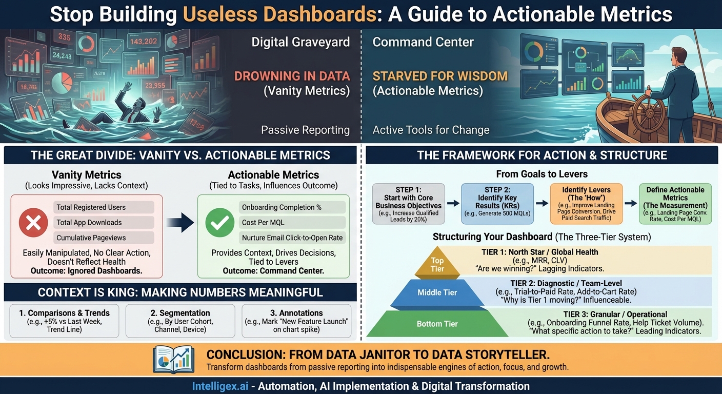
The Great Divide: Vanity vs. Actionable Metrics
Before building anything, we must understand the crucial distinction between two types of metrics. Failing to do so is the single most common reason dashboards fail.
Vanity Metrics are numbers that look impressive on the surface but don’t actually tell you anything about the health of your business or how you should act. They are often cumulative, easily manipulated, and lack context. Think “total registered users” or “total app downloads.” While a big number might feel great, it doesn’t tell you if those users are engaged, if they are your target audience, or if they are contributing to your bottom line. A million downloads mean nothing if 99% of users open the app once and never return.
Actionable Metrics, on the other hand, are tied to specific, repeatable tasks you can perform to influence a desired outcome. They provide context and help you make decisions. Instead of “total registered users,” an actionable alternative is “percentage of new users who complete the onboarding process.” If that number is low, you have a clear action: improve the onboarding flow. You can run an A/B test on the onboarding sequence and see if the metric moves. The metric is directly tied to a lever you can pull.
The litmus test for any metric on your dashboard should be: “If this number changes, will I know exactly what to do?” If the answer is no, it’s likely a vanity metric.
The Framework for Action: From Goals to Levers
An effective, action-oriented dashboard isn’t built by dragging and dropping every available data point into a grid. It’s architected with purpose, starting from the top down. The process begins not with data, but with strategy.
Step 1: Start with Your Core Business Objectives
Forget about data sources for a moment. Ask the most important question: What is our team or company trying to achieve right now? Are you focused on increasing market share, improving customer retention, boosting profitability, or enhancing operational efficiency? Your dashboard must be a direct reflection of these strategic goals. A sales team’s dashboard should look vastly different from an engineering team’s because their objectives are different.
- Bad Starting Point: “We have Google Analytics data, so let’s build a dashboard to show website traffic.”
- Good Starting Point: “Our Q3 objective is to increase qualified leads by 20%. Let’s build a dashboard to measure our progress and identify the levers that will get us there.”
Step 2: Identify the Key Results and Levers
Once you have a clear objective, you need to define how you’ll measure success. These are your Key Results (KRs). For the objective “increase qualified leads by 20%,” a Key Result might be “Generate 500 Marketing Qualified Leads (MQLs) this quarter.”
Now, here’s the critical step: identify the levers you can pull to influence that KR. What actions can your team take? These levers are what your actionable metrics will measure.
Let’s break down the “MQLs” example:
- Objective: Increase Qualified Leads by 20%.
- Key Result: Generate 500 MQLs this quarter.
- Levers (The “How”):
- Improve the conversion rate on our landing pages.
- Drive more high-intent traffic from paid search.
- Increase engagement with our email nurturing campaigns.
- Host a successful webinar.
- Actionable Metrics (The Measurement of “How”):
- Landing Page Conversion Rate (by campaign).
- Cost Per MQL (by channel).
- Click-to-Open Rate on Nurture Emails.
- Webinar Registrations vs. Attendee Rate.
Suddenly, you have a set of metrics that are intrinsically linked to actions. If Landing Page Conversion Rate is low, the team knows to start A/B testing headlines and calls-to-action. If Cost Per MQL from a specific channel is too high, they know to re-evaluate their ad spend and targeting.
Structuring Your Dashboard for Clarity: The Three-Tier System
A cluttered dashboard is an ignored dashboard. To avoid overwhelming users, organize your metrics into a logical hierarchy. A three-tier system works exceptionally well for providing both a high-level overview and the granular detail needed for action.
Tier 1: North Star / Global Health Metrics
At the very top of your dashboard should be 1-3 metrics that represent the ultimate goal of the team or product. This is your “North Star.” It answers the question, “Are we winning?” These metrics tend to be lagging indicators, meaning they change more slowly and are the result of many smaller activities.
- For a SaaS company: Monthly Recurring Revenue (MRR), Customer Churn Rate.
- For an E-commerce store: Customer Lifetime Value (CLV), Average Order Value (AOV).
- For a Content site: Number of Engaged Subscribers.
These metrics provide top-level context but are not directly actionable on a day-to-day basis. You can’t just “do” an action to increase MRR. You must influence the metrics in the tiers below.
Tier 2: Diagnostic / Team-Level Metrics
This middle tier is the heart of the dashboard. It explains why the North Star metric is moving. These are the Key Results and primary levers you identified in the previous step. They are owned by specific teams and are more directly influenceable.
- If the North Star is MRR, diagnostic metrics could be: New Trial Sign-ups, Trial-to-Paid Conversion Rate, Expansion Revenue (from upgrades).
- If the North Star is AOV, diagnostic metrics could be: Units Per Transaction, Adoption Rate of “Frequently Bought Together” recommendations.
When a Tier 1 metric looks good or bad, this is the first place a manager looks to understand the drivers behind the change.
Tier 3: Granular / Operational Metrics
This is where the rubber meets the road. These are the highly specific, day-to-day metrics that individuals can directly impact. They are often leading indicators—changes here will eventually affect the metrics in Tiers 2 and 1.
- Supporting “Trial-to-Paid Conversion Rate” (Tier 2): Onboarding Funnel Completion Rate, Time to First “Aha!” Moment, New User Help Ticket Volume.
- Supporting “Units Per Transaction” (Tier 2): Click-through rate on product recommendations, Add-to-cart rate from “quick add” buttons.
If the Onboarding Funnel Completion Rate drops, the product team has an immediate, specific problem to investigate. This is the definition of an actionable metric.
Context is King: Making Numbers Meaningful
A number in isolation is useless. The number “42” means nothing until you know the question. Similarly, “Conversion Rate: 3.2%” is just data. To turn it into information that drives action, you must provide context.
1. Comparisons and Trends
Every key metric on your dashboard needs a comparator. Is 3.2% good or bad? You don’t know without context.
- Trend Over Time: The most crucial context. Display the metric as a line chart showing its performance over the last 7 days, 30 days, or quarter. Is it trending up or down? Is there seasonality?
- Period-over-Period: Show the current value alongside the value from the previous period (e.g., this week vs. last week, this month vs. last month). A simple “+5% vs last week” indicator is incredibly powerful.
- Against a Goal: If you have a target for the metric (and you should!), visualize progress toward that goal. A simple bullet chart or gauge can show at a glance if you are on track.
2. Segmentation
Aggregate numbers hide the most important insights. An overall conversion rate of 3.2% might mask the fact that mobile traffic converts at 1.5% while desktop traffic converts at 5%. This is a hugely actionable insight! Your dashboard should allow for easy segmentation of key metrics by relevant dimensions:
- By User Cohort: How do users who signed up in May behave differently from those who signed up in June?
- By Marketing Channel: Which channels are bringing in your most valuable customers?
- By User Demographics: Are there differences in behavior by country, age, or plan type?
- By Device or Platform: Is your mobile experience underperforming?
When a team sees a top-level metric dip, their first instinct should be to segment the data to find the source of the problem. A great dashboard makes this easy.
3. Annotations
Your business doesn’t operate in a vacuum. Marketing campaigns launch, new features are deployed, competitors change their pricing, and bugs cause outages. A dashboard that doesn’t acknowledge these real-world events is incomplete. Annotate your charts to mark the dates of significant events. When you see a spike in traffic, an annotation for “New Blog Post Went Viral” immediately explains the “why” and prevents a frantic, unnecessary investigation.
Conclusion: From Data Janitor to Data Storyteller
Building an action-oriented dashboard is less about technical skill and more about a strategic mindset. It requires you to stop thinking like a data janitor, tasked with cleaning and displaying every piece of available information. Instead, you must become a data storyteller.
Your dashboard should tell a clear and compelling story about your business objectives. It should start with the grand plot (your North Star metric), introduce the main characters and their motivations (your team-level diagnostic metrics), and detail the daily dramas and actions that move the plot forward (your operational metrics). By focusing on goals, identifying levers, providing context, and organizing information logically, you can transform your dashboards from passive reporting tools into indispensable engines of action, focus, and growth.
Your Next Read:
Category:
Get a FREE
Proof of Concept
& Consultation
No Cost, No Commitment!