

A senior executive points to a number on a dashboard and asks a simple question: “Where did this come from?” For many organizations, that question triggers a frantic scramble. Analysts dig through queries, data engineers trace pipelines, and business teams compare conflicting spreadsheets. The answer, when it finally arrives, is often complex, slow, and unsatisfying. This single point of failure in data trust can undermine entire initiatives, from marketing campaign analysis to financial forecasting.
The core of the problem is a lack of visibility. When a key performance indicator (KPI) is treated like a magic number that simply appears in a report, it loses its credibility. The solution is to map its journey, step-by-step, from its raw origins to its final, aggregated form. This process creates a “lineage map,” an end-to-end blueprint that builds trust, accelerates debugging, and empowers teams to make decisions with confidence. It’s not just a technical exercise for the IT department; it’s a fundamental business practice for any data-driven organization.
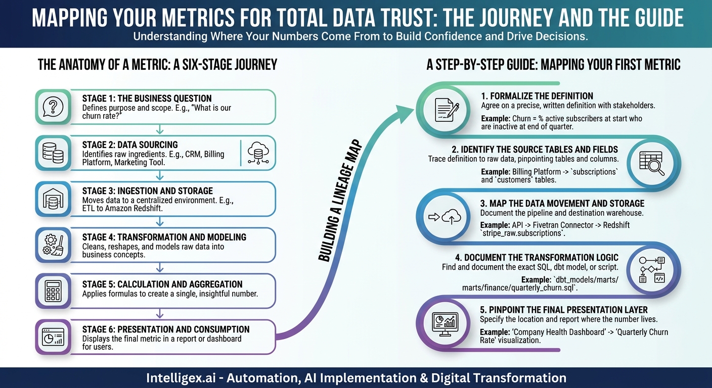
The Anatomy of a Metric: A Six-Stage Journey
Every metric, whether it’s “Customer Acquisition Cost” for Marketing or “On-Time Delivery Rate” for Supply Chain, follows a predictable path. Understanding these stages is the first step to mapping them. While the specific tools change, the functions remain consistent across any modern data stack.
Stage 1: The Business Question
A metric is never created in a vacuum. It begins with a question the business needs to answer. This is the most critical stage, as it defines the purpose and scope of the entire data journey. Without a clear, unambiguous question, the resulting metric will be meaningless at best and misleading at worst.
- Finance: “What is our monthly recurring revenue (MRR) churn rate?”
- Sales: “What is the average sales cycle length for enterprise accounts?”
- HR: “What is the voluntary attrition rate by department?”
Stage 2: Data Sourcing
Once the question is defined, you must identify where the raw ingredients live. This involves pinpointing the specific operational systems that capture the necessary events and attributes. A single metric often requires data from multiple sources.
For example, calculating “Customer Lifetime Value” (CLV) might require pulling data from:
- A CRM like Salesforce for customer account information.
- A payment processor like Stripe for transaction history.
- A marketing automation platform like HubSpot for acquisition channel data.
Failing to identify all the correct sources at this stage is a common reason why metrics fail to gain trust.
Stage 3: Ingestion and Storage
The raw data can’t be analyzed in its original location. It must be moved into a centralized analytical environment, typically a data warehouse or data lake. This process, often called ETL (Extract, Transform, Load) or ELT (Extract, Load, Transform), uses data pipelines to copy data from source systems into a structured, queryable format. This is where raw, operational data is consolidated into a single source of truth for analytics. Technologies like Amazon S3, Google BigQuery, or Snowflake are common destinations.
Stage 4: Transformation and Modeling
Raw data is rarely ready for analysis. It’s messy, inconsistent, and not structured to answer business questions directly. The transformation stage cleans, reshapes, and enriches the data. It’s where raw tables of “users” and “payments” are molded into well-defined concepts like “customers” and “subscriptions.” This involves several key steps:
- Cleaning: Handling null values, standardizing date formats, and correcting typos.
- Joining: Combining data from different sources (e.g., linking a customer ID from the CRM to their orders in the e-commerce platform).
- Modeling: Applying business logic to create new, meaningful fields. For example, categorizing customers into tiers (e.g., “Standard,” “Premium”) based on their spending habits.
Stage 5: Calculation and Aggregation
With clean, modeled data in place, the final metric can be calculated. This usually involves an aggregation query that performs the mathematical operations defined by the metric. For “Average Order Value,” the query would sum the total revenue and divide it by the count of unique orders within a specific time frame. This is the step that turns a large table of data into a single, insightful number.
Stage 6: Presentation and Consumption
The final stage is how the business consumes the metric. This is the dashboard, report, or application where the number is displayed. It could be a KPI card in a Tableau dashboard, a chart in a weekly email report, or a value surfaced within an operational tool. The presentation layer must be clear, provide context (like trends over time), and allow users to drill down for more detail if needed.
A Step-by-Step Guide: Mapping Your First Metric
Theory is useful, but practical application is what matters. Let’s create a lineage map for a common e-commerce metric: Quarterly Customer Churn Rate. This metric is critical for any subscription-based business, but it’s notoriously difficult to align on.
-
Formalize the Definition.
Get stakeholders from Finance, Marketing, and Product in a room (virtual or physical) to agree on a precise, written definition. Don’t move forward until this is done. For our example, the definition is: “The percentage of active subscribers at the beginning of the quarter who did not have an active subscription at the end of the quarter.” This simple sentence immediately clarifies key details. It excludes new subscribers acquired during the quarter and defines churn as a loss of active status.
-
Identify the Source Tables and Fields.
Trace the definition back to the raw data. Where does the information live? You’ll need to pinpoint the exact tables and columns.
- Source System: Billing Platform (e.g., Stripe, Chargebee)
- Required Data:
- A `subscriptions` table containing `customer_id`, `start_date`, `end_date`, and `status` (e.g., ‘active’, ‘canceled’).
- A `customers` table with `customer_id` and `creation_date`.
-
Map the Data Movement and Storage.
How does that data get from the billing platform into your analytical environment? Document the pipeline.
Example Path: Stripe API -> Fivetran Connector (Ingestion Tool) -> Amazon Redshift Data Warehouse (Storage). Specify the exact names of the schemas and tables in Redshift (e.g., `stripe_raw.subscriptions`).
-
Document the Transformation Logic.
This is where the magic and the mess often happen. You need to find the exact SQL query, dbt model, or Python script that transforms the raw data. A simplified version of the logic might look like this:
Step A: Identify the cohort of customers who were active at the start of the quarter.
Step B: Identify which of those cohort customers were no longer active at the end of the quarter.
Step C: Calculate `(Churned Customers / Total Customers in Cohort) * 100`.
It’s crucial to document the exact code or model name (e.g., `dbt_models/marts/finance/quarterly_churn.sql`). -
Pinpoint the Final Presentation Layer.
Where does the final number live? Be specific.
Example: “Company Health Dashboard” in Looker -> “KPIs” section -> “Quarterly Churn Rate” visualization. If possible, include a link to the report itself for internal reference.
By following these five steps, you’ve created a simple but powerful lineage map. When someone asks where the churn number comes from, you can now provide a clear, factual, and defensible answer in minutes, not days.
Common Pitfalls That Break Data Trust
Creating a lineage map is as much about avoiding common mistakes as it is about following the right steps. Many organizations struggle with data credibility because one or more of these pitfalls have become ingrained in their culture.
- Ambiguous Definitions: The most common failure point. If “active user” means one thing to Marketing and another to Product, any metric based on it is useless for cross-functional decisions. Solution: Create a shared, governed business glossary where metric definitions are agreed upon and documented.
- “Spreadsheet ETL”: A user exports data from a dashboard into a spreadsheet, applies jejich own custom logic, and shares the result. This manual step completely breaks the lineage chain, making the final number untraceable and irreproducible. Solution: Invest in self-service analytics tools and training so users can answer their own questions within the governed environment.
- Black Box Transformations: A critical piece of business logic lives inside a legacy script on a forgotten server or in a complex, undocumented stored procedure. No one knows exactly what it does, but everyone is afraid to touch it. Solution: Prioritize reverse-engineering and documenting these critical but opaque processes. Modern tools can often help automate this discovery.
- Lack of Ownership: A metric without a clear owner is an orphan. When it breaks or its definition needs updating, no one is responsible for fixing it. Solution: Assign clear ownership for every critical business metric. The owner is responsible for validating its accuracy and approving any changes to its logic.
The Role of Governance and Safe Implementation
As you map more complex metrics, especially those involving sensitive data or AI-driven components, governance becomes essential. A lineage map is a core component of a responsible data and AI strategy. It provides the necessary transparency to manage risk and ensure compliance.
When implementing lineage, particularly in automated systems, consider these key governance checks:
- Access Control: Who can see the lineage? While the final metric (e.g., “Total Employee Headcount”) might be widely visible, the raw data (e.g., individual salary information) must be strictly controlled. Your lineage tool and data warehouse should enforce role-based access controls at every stage.
- Data Privacy: Does the metric’s lineage involve Personally Identifiable Information (PII)? A lineage map helps you identify where PII is sourced, transformed, and used, which is critical for compliance with regulations like GDPR and CCPA. It highlights where masking or anonymization techniques should be applied.
- Human-in-the-Loop Review: For metrics generated by machine learning models (e.g., “Predicted Customer Churn Risk”), lineage must include the model version, key features used, and a record of when the model was last trained. It’s crucial to have a human review process to validate that the model’s outputs are fair, unbiased, and still relevant to business conditions.
Governance isn’t about slowing things down. It’s about building guardrails that allow you to move faster with confidence because you have a clear, auditable trail for how your data is being used.
The Business Impact: More Than Just a Pretty Map
The effort invested in building and maintaining metric lineage pays significant dividends across the organization. The value extends far beyond simple technical documentation.
Increased Speed and Agility
When a metric on a key dashboard suddenly looks wrong, the “fire drill” to find the root cause can paralyze a data team for days. With a clear lineage map, an analyst can quickly trace the data flow upstream, pinpointing whether the issue is a bug in the transformation logic, a data delay from a source system, or an API change. This reduces the time to resolution from days to hours, or even minutes.
Reduced Operational Cost
Without visibility, different teams often build their own separate, redundant pipelines and metrics to answer the same fundamental business questions. This wastes expensive engineering time and cloud computing resources. A transparent lineage map exposes this redundancy, allowing organizations to consolidate their efforts, deprecate unused data assets, and build a more efficient, cost-effective data infrastructure. A good place to start is with the cloud provider’s documentation on cost management, like the resources available at https://docs.aws.amazon.com/.
Improved Data Quality and Trust
This is the most important benefit. When business users, from executives to analysts, know they can click on a metric and see its full history, their confidence in the data skyrockets. This trust transforms data from a tool for validating past decisions into a strategic asset for driving future actions. It ends the circular arguments about “whose numbers are right” and focuses the conversation on what the numbers mean for the business.
Enhanced Scalability and Onboarding
As a company grows, so does its data complexity. A lineage map is an essential blueprint for a scaling organization. It dramatically speeds up the onboarding process for new data analysts and engineers, who can quickly understand how the core business logic is implemented. It also provides the visibility needed to safely modify or migrate data systems without causing unintended downstream consequences.
Your First Steps to Building a Lineage Map
Getting started with data lineage doesn’t require a massive, multi-year project or a huge investment in a new tool. The key is to start small, deliver value quickly, and build momentum. Follow this pragmatic, four-step approach.
- Pick One Critical Metric. Don’t try to map everything at once. Choose one high-visibility, high-impact metric that is frequently discussed or debated. Good candidates are often found in the company’s main financial or operational dashboards.
- Assemble the Cross-Functional Team. You need three perspectives: a business stakeholder who deeply understands the metric’s definition and use, a data engineer who knows the pipelines and source systems, and a data analyst who works with the final report or dashboard.
- Whiteboard the Journey. In a single session, manually trace the metric’s path from the presentation layer all the way back to the source systems. Draw boxes for systems and arrows for data flows. This low-fidelity exercise is incredibly effective at uncovering hidden dependencies and assumptions.
- Document and Share. Capture the output from your whiteboarding session in a simple, accessible format like a wiki page or a shared document. Your goal is not perfection, but a “version 1.0” that is immediately useful. Share it with the relevant teams and ask for feedback.
By mapping your first metric, you will not only solve a specific business problem but also demonstrate the immense value of this practice. This initial success creates the foundation for a more transparent, trustworthy, and truly data-driven culture.
Your Next Read:
Category:
Get a FREE
Proof of Concept
& Consultation
No Cost, No Commitment!